Astronomers who work on the Sloan Digital Sky Survey have released a brand-new 3D map of the entire universe.
The Sloan Digital Sky Survey is a decades-long project that has only had one goal: to map the universe. Now, it seems that they’ve managed to produce the largest-ever map to date.
Over 100 scientists have been working on the project, and the mapped over two million galaxies and quasars while doing so.
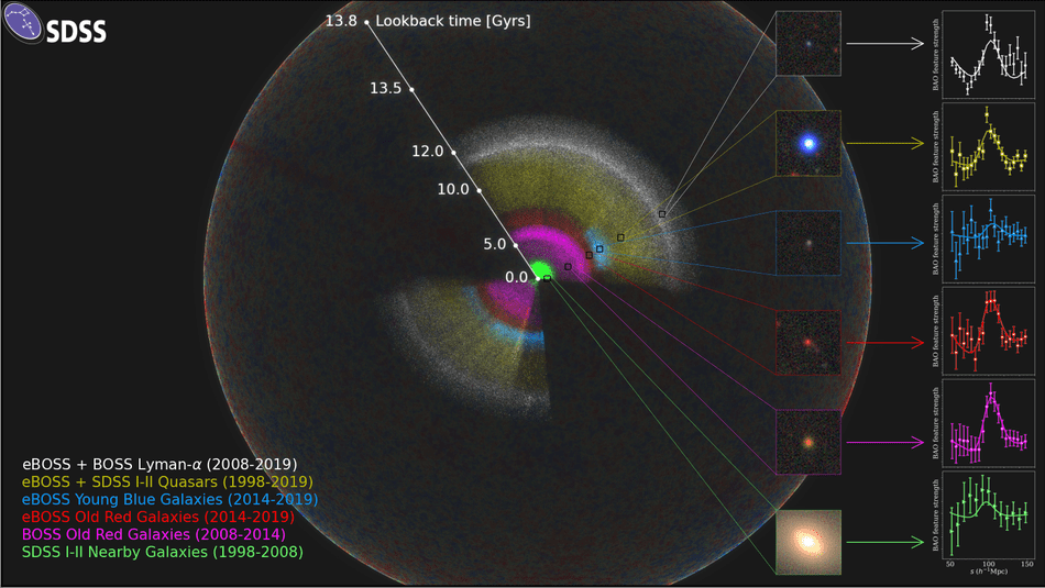
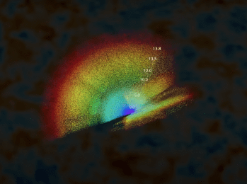
The scientists placed the Earth at the center of the map.
We are located at the center of this map. As we look out in distance, we look back in time.
When looking at this map, we see the light that is arriving on Earth from other galaxies. That light takes a long time to reach our planet. For example, it takes 2.5 million years from light from the Andromeda Galaxy to reach us here on our planet.
The map also shows other galaxies that are different distances from our home planet.
The scientists also explain that they use a “cosmic distance ladder” to figure out how far away a galaxy is.
This method depends on making accurate measurements of distances to nearby galaxies and then moving to galaxies farther and farther away, using their stars as milepost markers.
Astronomers use these values, along with other measurements of the galaxies’ light that reddens as it passes through a stretching universe, to calculate how fast the cosmos expands with time, a value known as the Hubble constant.
All of this going over your head a bit? Yeah, us too.
So here’s a video to explain more…
Isn’t this information amazing? Don’t forget to share the map with your friends, and let us know what you think about it in the comments!
The post Scientists Put Together the Largest Map of the Universe Ever and It Is a Sight to Behold appeared first on UberFacts.