Road scouts

It used to be a job to drive around the country, constantly, driving and measuring every road, grade, elevation, and distance, in order to keep road maps updating accurately every two weeks. “Road scouts” would drive enough miles in a year to make multiple trips to the moon.

The post Road scouts appeared first on Crazy Facts.

Scientists Put Together the Largest Map of the Universe Ever and It Is a Sight to Behold

Astronomers who work on the Sloan Digital Sky Survey have released a brand-new 3D map of the entire universe.

The Sloan Digital Sky Survey is a decades-long project that has only had one goal: to map the universe. Now, it seems that they’ve managed to produce the largest-ever map to date.

Over 100 scientists have been working on the project, and the mapped over two million galaxies and quasars while doing so.

The scientists placed the Earth at the center of the map.

We are located at the center of this map. As we look out in distance, we look back in time.

When looking at this map, we see the light that is arriving on Earth from other galaxies. That light takes a long time to reach our planet. For example, it takes 2.5 million years from light from the Andromeda Galaxy to reach us here on our planet.

The map also shows other galaxies that are different distances from our home planet.

The scientists also explain that they use a “cosmic distance ladder” to figure out how far away a galaxy is.

This method depends on making accurate measurements of distances to nearby galaxies and then moving to galaxies farther and farther away, using their stars as milepost markers.

Astronomers use these values, along with other measurements of the galaxies’ light that reddens as it passes through a stretching universe, to calculate how fast the cosmos expands with time, a value known as the Hubble constant.

All of this going over your head a bit? Yeah, us too.

So here’s a video to explain more…

Isn’t this information amazing? Don’t forget to share the map with your friends, and let us know what you think about it in the comments!

The post Scientists Put Together the Largest Map of the Universe Ever and It Is a Sight to Behold appeared first on UberFacts.

In 2010 a man was rescued while attempting…

In 2010 a man was rescued while attempting to sail around the United Kingdom. Using only a road map for navigation the ‘sailor’ had been keeping the coast to his right and in error ended up sailing in circles around the Isle of Sheppey until he ran out fuel.

Here are Some Interesting Maps of Stuff You Wouldn’t Normally Think to Map

I remember studying atlases for hours when I was a kid and being fascinated by all of the exotic and strange places around the world.

So in the spirit of rekindling my childhood obsession with all things map-related, here are some very interesting maps about all kinds of random things that are quite fascinating.

Let’s take a look.

1. An eagle’s movements tracked over a 20-year period.

Photo Credit: Reddit

2. Tracking different packs of wolves in Voyageurs National Park. You can see how they avoid each other’s territory.

Photo Credit: Reddit

3. Countries talked about in the Bible.

Photo Credit: Reddit

4. The U.S. from an Alaskan perspective.

Photo Credit: Reddit

5. Where flamingos live around the world.

Photo Credit: Reddit

6. The longest possible way to travel by train in the world.

Photo Credit: Reddit

7. Different giraffe patterns in Africa.

Photo Credit: Reddit

8. Each section contains 10% of the world’s population.

Photo Credit: Reddit

9. Locations from Johnny Cash’s song “I’ve Been Everywhere.”

Photo Credit: Reddit

10. The populations of the Dakotas and Manhattan, NYC.

Photo Credit: Reddit

11. 50% of Canadians live below that red line.

Photo Credit: Reddit

12. How much snow it takes to cancel schools.

Photo Credit: Reddit

13. The entire continent of South America is east of Michigan.

Photo Credit: Reddit

Those are awesome!

What did you think? Are you a big map fan?

Tell us all about it in the comments. And if you have a map you’d like to share with us, let’s see it!

The post Here are Some Interesting Maps of Stuff You Wouldn’t Normally Think to Map appeared first on UberFacts.

Map Outlines What People Think Is the Worst City in Each State

This chart is sure to cause some serious disagreements among people. It comes to us via Matt Shirley, who makes a new chart on his Instagram page every day.

Here are some past examples of charts he’s come up with in the past.

View this post on Instagram

🐕

A post shared by Matt Shirley (@mattsurelee) on

View this post on Instagram

Please note the purple line’s fluctuations.

A post shared by Matt Shirley (@mattsurelee) on

View this post on Instagram

Show me your bingos. @truly #TrulyPartner

A post shared by Matt Shirley (@mattsurelee) on

To create “The Worst City in Every State” map, Shirley asked his 292,000 Instagram followers to weigh in on the topic, so it’s not complete or scientific by any means. But it will probably get a lot of people talking.

Here is the full map:

And here’s an alphabetical list of the findings state-by-state:

Alabama: Birmingham

Alaska: Wasilla

Arizona: Mesa

Arkansas: Pine Bluff

California: Modesto (Northern) Bakersfield (Southern)

Colorado: Pueblo

Connecticut: Bridgeport

Delaware: Wilmington

Florida: Orlando

Georgia: Macon

Hawaii: Kalihi

Idaho: Caldwell

Illinois: Cairo

Indiana: Gary

Iowa: Cedar Rapids

Kansas: Topeka

Kentucky: Lexington

Louisiana: Turkey Creek

Maine: Rumford

Maryland: Poolesville

Massachusetts: Worcester

Michigan: Flint

Minnesota: Edina

Mississippi: Jackson

Missouri: Jefferson City

Montana: Browning

Nebraska: Fremont

Nevada: Sparks

New Hampshire: Manchester

New Jersey: Camden

New Mexico: Hobbs

New York: Albany

North Carolina: Gastonia

North Dakota: Grand Forks

Ohio: Dayton

Oklahoma: Ardmore

Oregon: Salem

Pennsylvania: Scranton

Rhode Island: Woonsocket

South Carolina: Greer

South Dakota: Brookings

Tennessee: Memphis

Texas: Dallas

Utah: Provo

Vermont: Rutland

Virginia: Virginia Beach

Washington: Spokane

West Virginia: Welch

Wisconsin: Manitowoc

Wyoming: Rock Springs

What do you think of this map and its findings?

Let us know in the comments, please.

The post Map Outlines What People Think Is the Worst City in Each State appeared first on UberFacts.

Think You Know What the World Looks Like? Here’s the True Size of Each Country.

Maps maps maps!

There were maps on the walls of our classrooms every year of our childhood. We look at them to get around (some of us even use maps on paper!), and Google uses them to help us get from point A to point B.

But it turns out those maps aren’t entirely accurate.

Because it is likely that every map you’ve ever seen is based on the Mercator projection, which was designed almost 450 years ago and has some pretty serious flaws.

It was presented by Flemish cartographer Gerardus Mercator in 1569, and though it’s been useful for exploration – it allows for the plotting of a straight-line course on a globular planet and maintains the true shape of a country – translating a three-dimensional globe into two-dimensional map distorts both size and distance the closer you get to the poles.

So, maps haven’t been reflecting the size of many countries accurately since, well…forever.

Not only that, but the map has been accused of having political undertones that reinforce a Eurocentric colonial view of the world.

Now, though, companies like Yahoo and Google are using an Equal Earth projection map created by a group of contemporary cartographers in 2018 – one that overcomes many of the numerous issues with the Mercator projection.

Climate data scientist Neil Kaye created a map visualization that alternates between the Mercator projection and the true projections, and the resulting GIF is pretty fascinating to watch.

Russia, Canada, and Greenland completely changed size, while parts of Europe, Asia, and the Americas also shrink quite a bit.

In original maps, Greenland appears larger than Africa when, in reality, they’re not even close – Africa is 14x bigger than Greenland.

“Each country is projected to the spherical projection and placed at the center of where it appears in the Natural Earth projection,” he explained on Reddit. “There was then some manual tweaking of countries that are closer to the poles. …This demonstrates you can’t fit shapes on a sphere back together again once you put them on the flat.”

So even though this map gives us more accurate country size, it still doesn’t give us entirely accurate country shape.

That’s just a reality of geometry – you can’t reproduce the surface of a 3-d object entirely faithfully on a 2-d plane.

But in the name of people who enjoy accuracy everywhere, I say bring on the (more) correct maps of the world!

I wonder how many classrooms are going to need new maps, though.

Oh, well, I’m sure the teachers can afford it. (sarcasm font)

The post Think You Know What the World Looks Like? Here’s the True Size of Each Country. appeared first on UberFacts.

This Map Compares the Education Level in Each State to a Corresponding Country, and it’s Offending Everyone

We all know Americans like to think they’re number one at just about everything, but the truth is…that’s just not the truth. In fact, perhaps it’s their low education levels that makes them believe such a thing in the first place!

According to the Organization for Economic Cooperation, American students rank 28th in math and science scores (for those not good at math, it means there are 27 better countries). The educated people at Home Snacks made a map of the United States comparing each state with a foreign country that is said to have similar education levels, using the United Nations Development Program index. Understanding this map will take knowledge of both United States and world geography, which means you’ll most likely get it if you live in the Northeast.

usmapfinal-YkBDxYHere it is zoomed in, if that helps you focus.

northeast-U6y9NP
The Northeast and Midwest tend to be on a similar track as European countries.

southeast-DRuiDL
While the Southeast is largely comparable to Central America and Africa.

northwest-gvINkk
The Northwest appears to be the most diverse.

southwest-huy8N7
Although the Southwest is pretty diverse in its own right.

I guess like everything else in America, there are advantages and disadvantages to living in every nook and cranny of the country – but I’m not placing any bets on people deciding to forgo their home state for better education grounds anytime soon.

(h/t: Someecards)

We know you can choose a lot of sites to read, but we want you to know that we’re thankful you chose Did You Know.

You rock! Thanks for reading!

The post This Map Compares the Education Level in Each State to a Corresponding Country, and it’s Offending Everyone appeared first on UberFacts.

Interactive Maps Show How Climate Change Could Affect Your City

While there are still a decent amount of folks in government and civilian life who believe climate change isn’t real (or that it’s “not that bad”), the facts are undeniable: our planet is changing at an alarming pace.

Two interactive maps, one from the National Oceanic and Atmospheric Administration and one from the University of Maryland’s Center for Environmental Science, show how climate change might affect every part of the U.S. in 80 years and 60 years, respectively.

Photo Credit: Public Domain Pictures

You can explore the maps for yourself HERE and HERE, but let’s break down some of the findings from the maps.

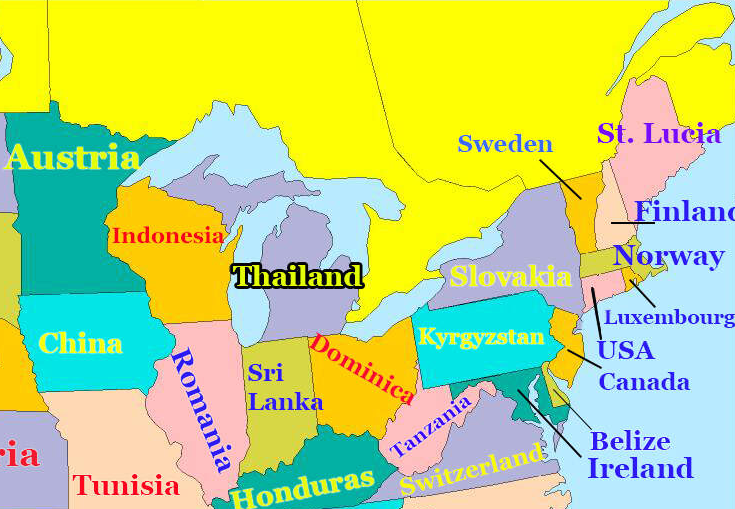
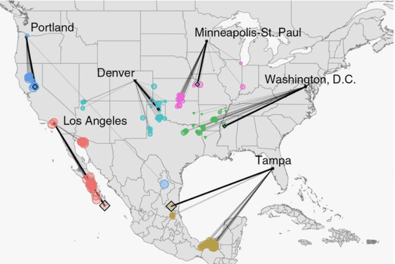
This overview image is particularly telling. It shows what the climate of different cities might look like in 2080 based on current emissions trend-lines. As you can see, in only 60 years (within your lifetime?) Minneapolis will likely feel more like Oklahoma, assuming no successful action is taken to curb greenhouse gases.

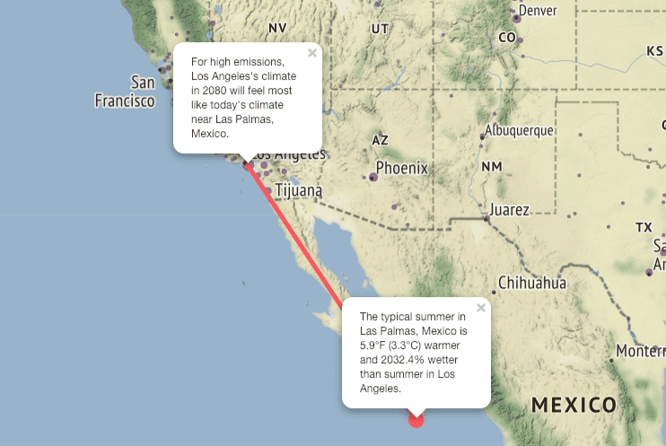
According to the research, here’s what what it might feel like Los Angeles in 60 years.

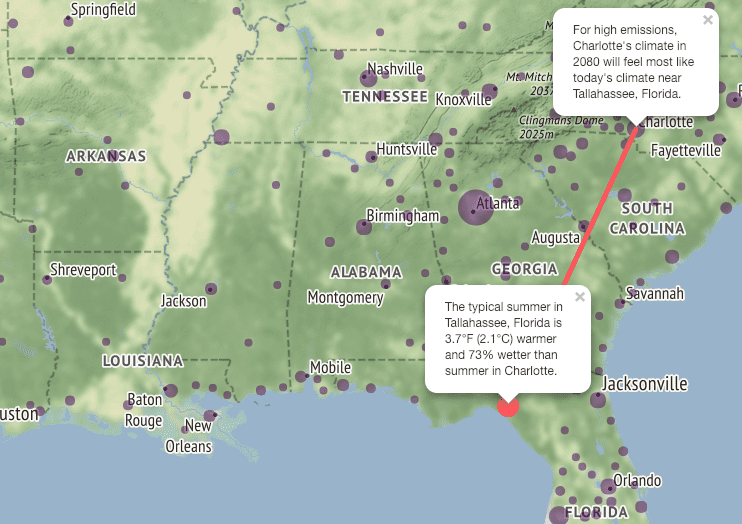
Here is a snapshot of the Southeastern United States, focusing on Charlotte, North Carolina.

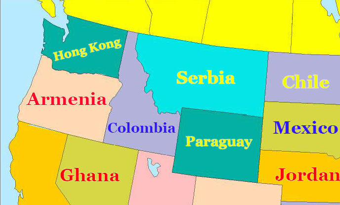
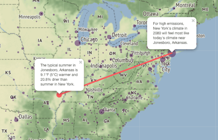
How will the Big Apple fare in 2080? Take a look.

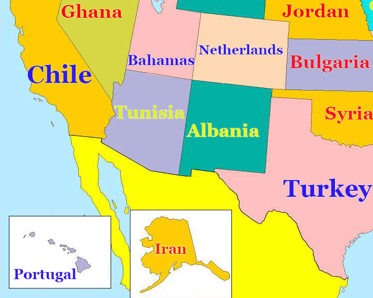
NYC’s temperature will feel more like that of Jonesboro, Arkansas, which is more than 9 degrees warmer and 20% drier during the summer than the people of New York currently experience. And if you’ve ever been through a summer in New York, you know that if it got 9 degrees hotter…well, it’s pretty horrific to imagine.

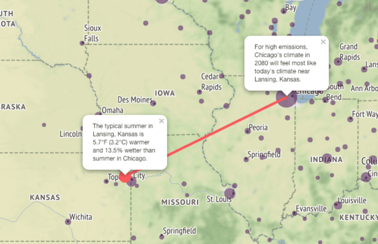
Chicago has been in the news lately for its extreme cold weather, but in 60 years the weather in the Windy City might feel more like northeast Kansas.

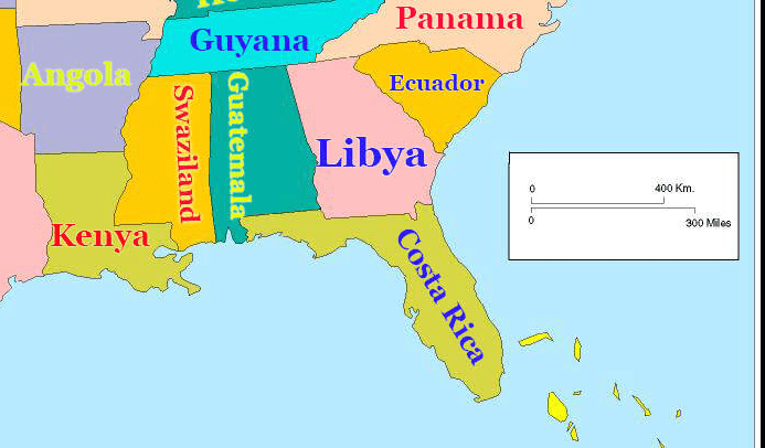
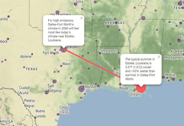
As if Dallas wasn’t hot and sticky enough in the summertime, in 2080 the climate might feel more like that of New Orleans.

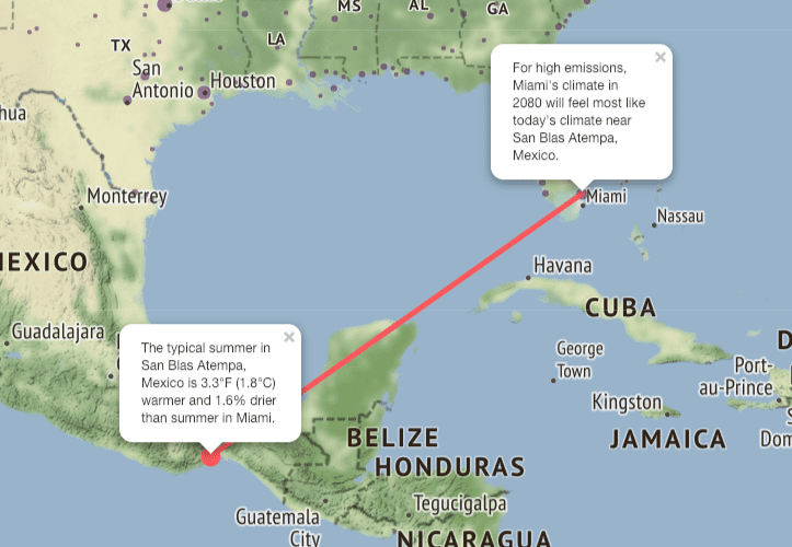
A final example from the 2080 map, from Miami, Florida:

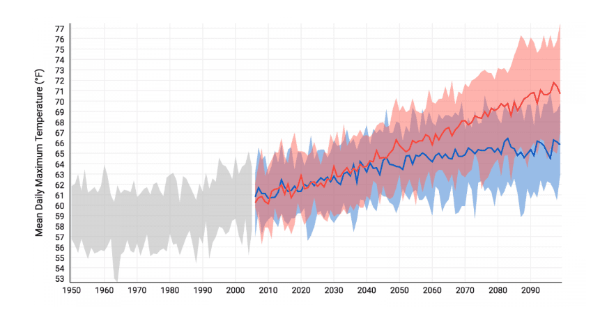
The map from the National Oceanic and Atmospheric Administration, which is a little more difficult to figure out, allows you to explore how climate change might affect cities and towns in the U.S. from 2010 to 2100 and also offers historical climate data from 1950 to 2010.  Here is an example.

The average daily maximum temperature in for Cook County, Illinois (which includes Chicago).

Photo Credit: NOAA

As you can see, it’s already warmed up, and it’ll just keep on getting hotter and hotter.

Look, the more we know about climate change, the better – and that means politicians, scientists, and normal citizens like you and me. It’s no longer an excuse to say “I’m not a scientist,” cause the scientists have made maps that do all the work for you. We’re not gonna solve this problem on a small individual scale. It’s time to pull together folks!

The post Interactive Maps Show How Climate Change Could Affect Your City appeared first on UberFacts.