

While there are still a decent amount of folks in government and civilian life who believe climate change isn’t real (or that it’s “not that bad”), the facts are undeniable: our planet is changing at an alarming pace.
Two interactive maps, one from the National Oceanic and Atmospheric Administration and one from the University of Maryland’s Center for Environmental Science, show how climate change might affect every part of the U.S. in 80 years and 60 years, respectively.

Photo Credit: Public Domain Pictures
You can explore the maps for yourself HERE and HERE, but let’s break down some of the findings from the maps.
This overview image is particularly telling. It shows what the climate of different cities might look like in 2080 based on current emissions trend-lines. As you can see, in only 60 years (within your lifetime?) Minneapolis will likely feel more like Oklahoma, assuming no successful action is taken to curb greenhouse gases.
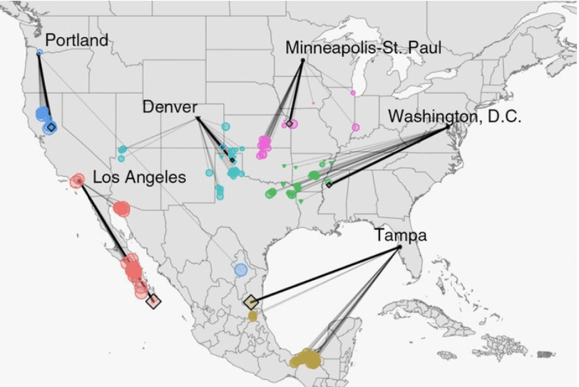
Photo Credit: University of Maryland Center for Environmental Science
According to the research, here’s what what it might feel like Los Angeles in 60 years.
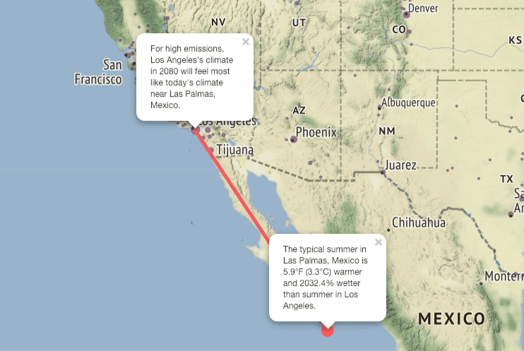
Photo Credit: University of Maryland Center for Environmental Science
Here is a snapshot of the Southeastern United States, focusing on Charlotte, North Carolina.
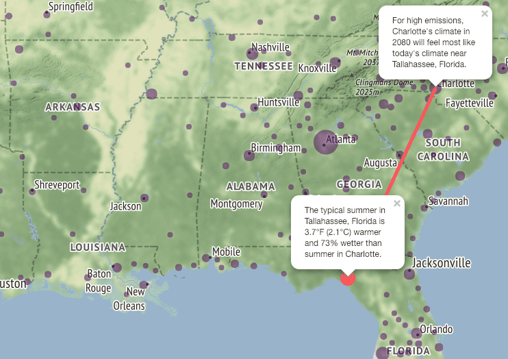
Photo Credit: University of Maryland Center for Environmental Science
How will the Big Apple fare in 2080? Take a look.
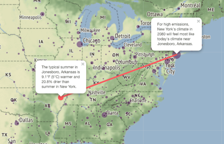
Photo Credit: University of Maryland Center for Environmental Science
NYC’s temperature will feel more like that of Jonesboro, Arkansas, which is more than 9 degrees warmer and 20% drier during the summer than the people of New York currently experience. And if you’ve ever been through a summer in New York, you know that if it got 9 degrees hotter…well, it’s pretty horrific to imagine.
Chicago has been in the news lately for its extreme cold weather, but in 60 years the weather in the Windy City might feel more like northeast Kansas.
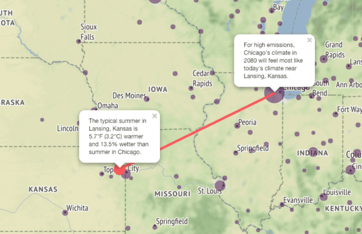
Photo Credit: University of Maryland Center for Environmental Science
As if Dallas wasn’t hot and sticky enough in the summertime, in 2080 the climate might feel more like that of New Orleans.
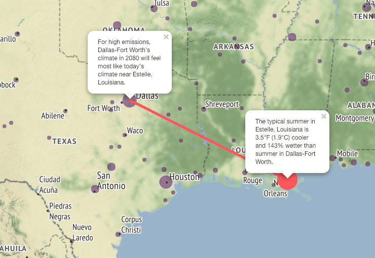
Photo Credit: University of Maryland Center for Environmental Science
A final example from the 2080 map, from Miami, Florida:
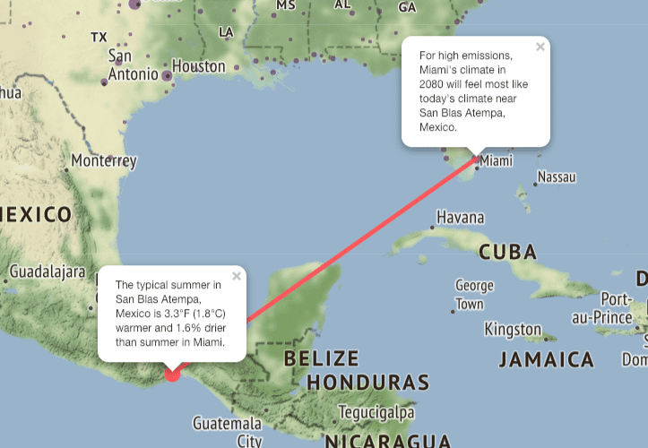
Photo Credit: University of Maryland Center for Environmental Science
The map from the National Oceanic and Atmospheric Administration, which is a little more difficult to figure out, allows you to explore how climate change might affect cities and towns in the U.S. from 2010 to 2100 and also offers historical climate data from 1950 to 2010. Here is an example.
The average daily maximum temperature in for Cook County, Illinois (which includes Chicago).
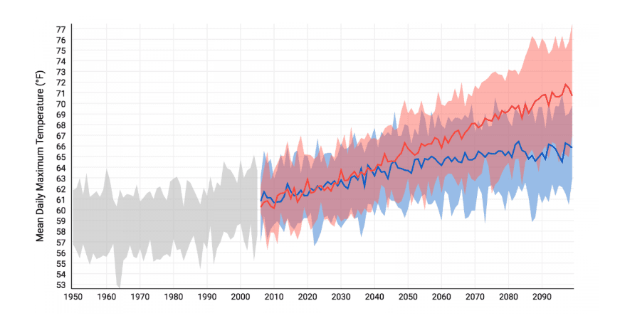
Photo Credit: NOAA
As you can see, it’s already warmed up, and it’ll just keep on getting hotter and hotter.
Look, the more we know about climate change, the better – and that means politicians, scientists, and normal citizens like you and me. It’s no longer an excuse to say “I’m not a scientist,” cause the scientists have made maps that do all the work for you. We’re not gonna solve this problem on a small individual scale. It’s time to pull together folks!
The post Interactive Maps Show How Climate Change Could Affect Your City appeared first on UberFacts.