Weird Designs That Will Make You Stop and Think

Designing stuff is really hard. Engineering is difficult.

Shaping the things we use and have around us at all times is a bit of a thankless task, because when it all goes right, nobody really notices it.

But when it all goes wrong? Well, that’s the stuff of memes.

10. Microwaves

These things have been around for like 70 years now, can we please improve some tech?

9. These safety pamphlets

Were they just copying and pasting to save on some graphic design costs?

8. Some banners

You might want to hire a good translator next time.

7. Scales

We all look at technology differently.

6. These weird sinks

Is it some sort of status symbol? A game? What’s going on here?


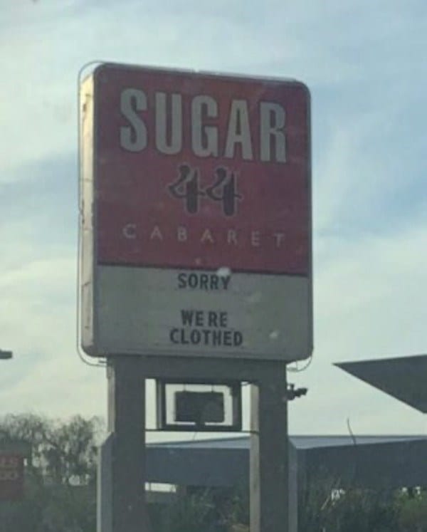
5. This restaurant sign

Cutting right to the chase and making me feel adequately stupid.

4. This Christmas display

The Miller Lite can at his feet is a nice touch.

3. Battery naming

Never understood this system. Can’t wrap my head around it for the life of me.

2. These butter knock-offs

I wonder if you could legally name your product “I Can’t Believe It’s Not ‘I Can’t Believe It’s Not Butter.’”

1. Texans

They wear their national flag proudly.

But seriously, can we talk about microwaves for a second? We’ve got 3D printers that can make you a new kneecap at home but my hot food box still isn’t capable of creating a warm-inside hot pocket? I call shenanigans.

What’s your favorite design oddity?

Tell us in the comments.

The post Weird Designs That Will Make You Stop and Think appeared first on UberFacts.

Enjoy These Incredible Before and After Design Projects

If you’ve been considering rehabbing a room in or completely gutting a whole floor in your house, you should probably take a look at these photos.

Because they’re going to take your breath away!

These before and after pics will prove to you that you can turn around the entire character and look of your home if you go about it the right way.

Color us very impressed! Are you ready to be inspired?

Be sure to click on the arrows on the right side of the posts so you can see the AFTER photos. Enjoy!

1. What a great renovation!

I’d love to hang out back there.

2. This is totally amazing.

I never thought I’d want to live on a school bus, but this changed my mind.

3. A total rehab.

And it looks great!

4. What a unique idea.

Have a seat and have a drink.

5. A great place to make a meal.

The colors really pop, too!

6. A job well done!

I love it!

7. A total rehab.

And the cat seems to like it, as well.

8. That place was cluttered to the max.

Now it’s nice and open.

9. Wow. Doesn’t even look like the same house.

I love the colors!

10. A beautiful kitchen rehab.

I’m a big fan of this one.

11. A tear-down with a replacement.

Looks like a very cool house.

Now we want to hear from you!

In the comments, share some pics of your home improvement projects that you’re proud of.

We can’t wait to see your handiwork!

The post Enjoy These Incredible Before and After Design Projects appeared first on UberFacts.
These Designers Had One Job and Blew It

You only had one job!

How many times have you heard that in your life? Or maybe that’s just me that’s heard that over and over throughout the years…

Anyway, you would think that people who make their living as designers would be pretty tuned into the idea that the DESIGN of whatever product they’re designing is the most important thing and it can’t be messed up. AT ALL.

But, apparently, these people didn’t get that memo because these final designs are NG…and that means NO GOOD.

Take a look at these design fails and keep your fingers crossed that these folks still have jobs…

1. Let’s all give THONKS for our blessings.

THONK you very much!

Give Thonks from CrappyDesign

2. That’s really not pleasant to look at.

My eyes! They’re burning!

Kind of a crappy design if you ask me from designfails

3. There might be something wrong with that milk…

What happened here?

Yess milk from designfails

4. Mixed messagses.

We’re You’re Not ‘Til Not Happy? Got it!

We’re You’re Not ‘Til Not Happy? from designfails

5. I think they meant to say Ho Ho Ho.

This sign now has a whole new meaning.

Something isn’t right here from ShittyDesign

6. They really nailed the packaging.

Wow…this is something else…

Ah yes the cherry gum from ShittyDesign

7. A sad state of affairs.

This is NOT GOOD.

Didn’t think about the doors being open did they? from designfails

8. Oh, gross! Ewwwww!

Bad sticker placement! Very bad!

Yes, Ew. from designfails

9. I’ll take the chips, without chips.

Does that make sense?

Would you like your chips with or without chips? from CrappyDesign

10. Click right there.

Will this work?

Click here on a newspaper from designfails

11. Be sure to practice.

Now I’m scared…

Why?? from designfails

12. You have to climb in.

Well, do you want pizza or not?!?!

Feel like this should be here from designfails

13. Just imagine…

This is a real mind-bender.

Hmm yes, the floor here is made out of floor from designfails

Okay, now it’s your turn!

Have you seen any really, really bad designs lately?

If so, please share them with us in the comments.

We’d love to hear from you!

The post These Designers Had One Job and Blew It appeared first on UberFacts.
These Designers Were All Really Creating for the People Who Use Their Products

In a world where we can get just about anything we want with only a click of a mouse or a swipe on a screen, it can feel a little exhausting to constantly be marketed to.

That potential for exhaustion makes it extra nice when you see a product that is so clearly designed for the person who will buy it.

From doormats that were clearly designed to help you out to a mug that doubles as a hand warmer, here are 10 times that designers proved they had their users in mind when they came up with a product.

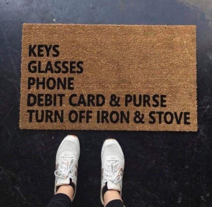
1. This wonderful doormat

It’s cute and it also reminds you of everything you need to take out with you.

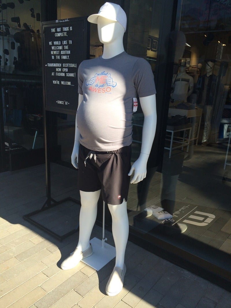
2. A helpful mannequin

It shows you what the shirt will really look like.

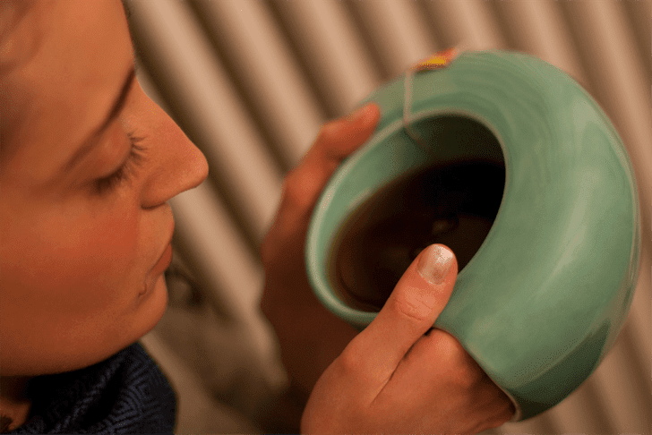
3. This mug that warms you up.

This is legitimately a brilliant invention. It’s so cozy!

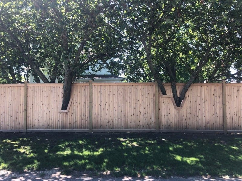
4. This tree-friendly fence

This is such a great idea for anyone who is willing to work with and around nature.

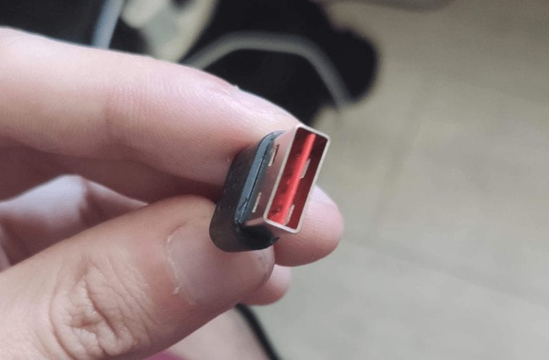
5. An amazing USB connector

Gone are the days of flipping it one way and then the other, because both ways work!

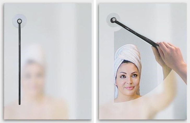
6. This bathroom must-have

A windshield wiper… for your mirror!

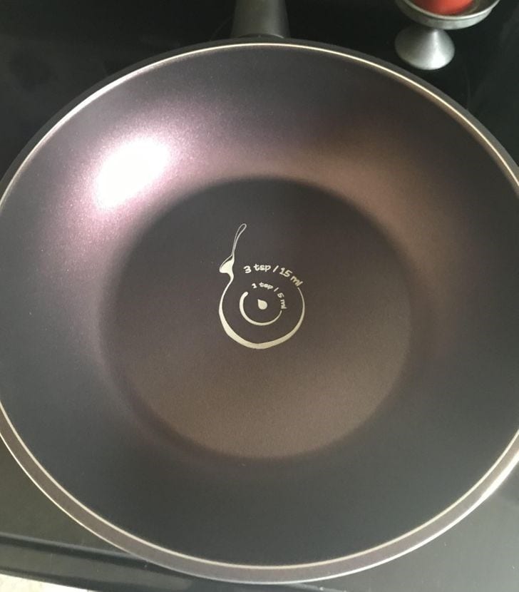
7. This helpful wok

The circles show you exactly how much oil you’ve added.

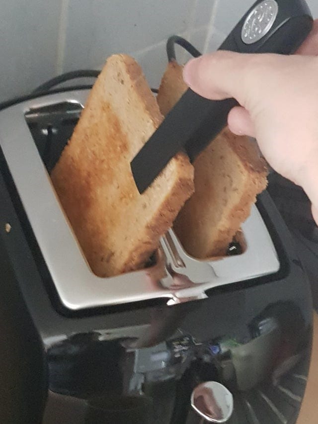
8. Toast grabbers!

Are you tired of burning your hands? This toaster solves that problem for you.

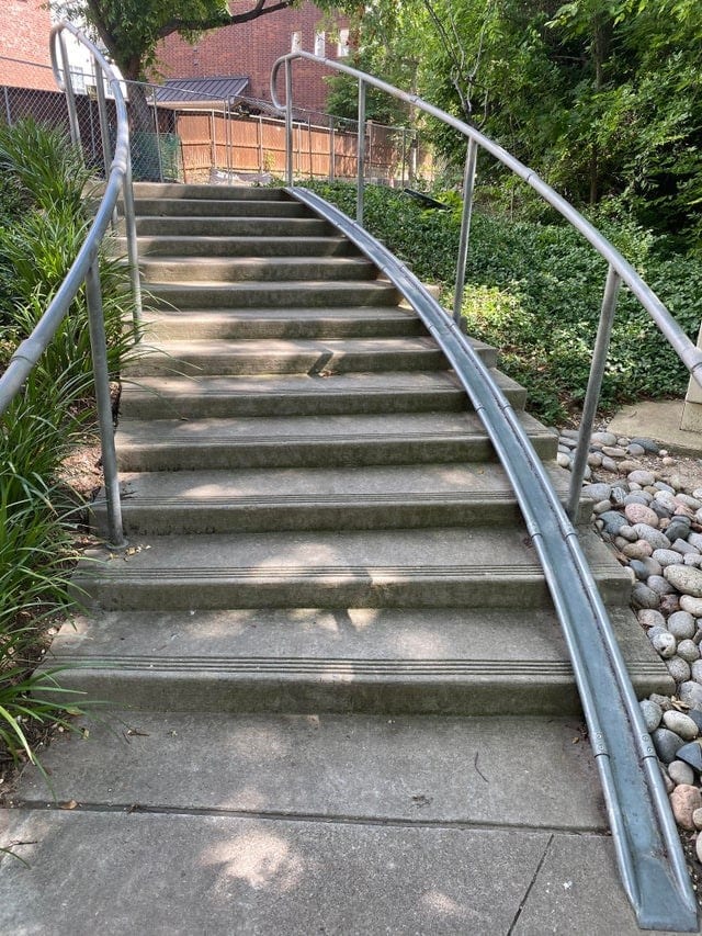
9. Bike-friendly stairs

Truly a wonderful invention for every cyclist!

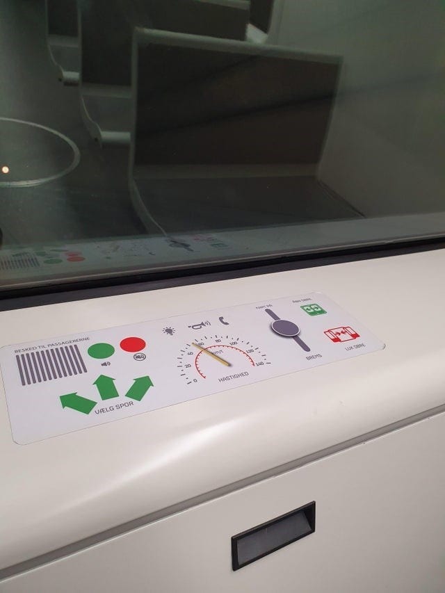
10. A kid-friendly train

In Copenhagen, the train carts without drivers have “buttons” that kids can play with while they ride.

Aren’t these products pretty cool? Those toast grabbers are seriously impressive. Let us know which is your favorite in the comments!

The post These Designers Were All Really Creating for the People Who Use Their Products appeared first on UberFacts.

Design Fails by People Who Had Exactly One Job

You only had one job!

How many times have you heard that yelled in your face before?

Or maybe in someone else’s face who you worked with?

The point is, a lot of people make big mistakes in the design field and some of them are just so good that they must be shared with the world.

Like these!

They’re really bad, but we think you’ll get a big laugh out of them! So enjoy!

1. Do you think they thought this one through?

I’m not so sure about that…

Photo Credit: Cheezburger

2. Soup for Sluts!

It sounds delicious!

Photo Credit: Cheezburger

3. Do these two billboards belong side-by-side?

Sending some mixed signals…

Photo Credit: Cheezburger

4. Take a closer look at the dress.

Come on, people…

Photo Credit: Cheezburger

5. SLIMING herb.

Sounds kind of…slimy…

Photo Credit: Cheezburger

6. Poor Granny…she never saw this coming.

I, for one, am quite offended by this.

Photo Credit: Cheezburger

7. Grandma really can’t catch a break.

They had to do it…

Photo Credit: Cheezburger

8. Kit Ka…

I would think you’d at least want the WHOLE name of your product on there, but what do I know?

Photo Credit: Cheezburger

9. Load up on lighter fluid kids!

Seems like a REALLY bad idea.

Photo Credit: Cheezburger

10. Just looks really disturbing.

Something to nibble on…

Photo Credit: Cheezburger

11. A watch! For the kids!

Just ignore the shape, I guess…

Photo Credit: Cheezburger

12. Perfect placement.

Do you think this is a big seller?

Photo Credit: Cheezburger

13. Yikes…let’s end on that note.

Not a good look…not good at all…

Photo Credit: Cheezburger

I hope these folks still have jobs…because those are some major FAILS!

Now we want to hear from all the readers out there.

Have you seen any really bad design fails lately?

If so, please share them with us in the comments. We’d love to see them!

The post Design Fails by People Who Had Exactly One Job appeared first on UberFacts.

This Instagram Account Show the Very Worst in Interior Design

I’m just some random guy – not much of an interior decorator. It’s simply not a skill set I’ve got, plus I’ve never had much of a budget to work with. But when things in that realm get bad enough, even I can tell.

Instagram user Dina Holland runs an account called “pleasehatethesethings” under the handle @honeyandfitz. Over a quarter million people follow to see her hundreds of posts on “absurd, ugly & just plain stupid things in home design.” It’s truly a masterpiece you can get lost in for hours, but here are 15 of my favorite examples.

15. Monkey business

I feel like an Indiana Jones villain is going to pop out and kill me if I get in this tub.

View this post on Instagram

Calgon, take me far far away from here.

A post shared by Dina Holland @honeyandfitz (@pleasehatethesethings) on

14. Taxi-derpy

Ah yes, no kitchen is complete without an undead Bobcat watching over my mac & cheese.

View this post on Instagram

Cute kitchen Carol but we all know you killed him.

A post shared by Dina Holland @honeyandfitz (@pleasehatethesethings) on

13. Take the red pill

I just found out my eyes can scream, so that’s fun.

View this post on Instagram

I stubbed my toe just looking at this.

A post shared by Dina Holland @honeyandfitz (@pleasehatethesethings) on

12. The double deuce

There is such a thing as too much intimacy.

View this post on Instagram

No one is this in love.

A post shared by Dina Holland @honeyandfitz (@pleasehatethesethings) on

11. Too bad, toe bed

Are those like, decoy feet for the monsters?

10. Going down

No thanks, I’ll just hold it for the rest of my life.

9. Mild tub

For the couples that want very little to do with each other.

8. Black & yellow, black & yellow

There’s gold in them thar everything.

7. Throwing shade

Yanno, my office could use a dash of sexual nightmare, come to think of it.

View this post on Instagram

What about psychotherapy? Is psychotherapy included?

A post shared by Dina Holland @honeyandfitz (@pleasehatethesethings) on

6. Just need to vent

I’m not even mad about this one, I find it weirdly adorable.

View this post on Instagram

Custom AF.

A post shared by Dina Holland @honeyandfitz (@pleasehatethesethings) on

5. Wipe ’em out

There are at least three things wrong with this picture.

View this post on Instagram

Had more than one in the chamber I guess?

A post shared by Dina Holland @honeyandfitz (@pleasehatethesethings) on

4. Loud and proud

I mean look, you do you, but…no thank you.

View this post on Instagram

Takes 1 decorative painting class at Michaels.

A post shared by Dina Holland @honeyandfitz (@pleasehatethesethings) on

3. Notch in the bedpost

This is 100% in a cult compound somewhere.

View this post on Instagram

You better deliver.

A post shared by Dina Holland @honeyandfitz (@pleasehatethesethings) on

2. A sinking feeling

It’s good to have a creative outlet.

1.Waterbed

The second most intimidating meaning of “sleeping with the fishes.”

View this post on Instagram

First of all. No.

A post shared by Dina Holland @honeyandfitz (@pleasehatethesethings) on

I still don’t feel like I know a lot more about what to do with interior design, but maybe I know a little bit more about what not to do? That’s gotta be worth something, right?

What’s the worst design choice you’ve ever seen?

Share it with us in the comments.

The post This Instagram Account Show the Very Worst in Interior Design appeared first on UberFacts.

Weird Signs That Will Make You Do a Double Take

When I first moved to a city, one of the unexpected challenges was reading the parking signs. It wasn’t that they were too small, or dirty, or that my vision was bad, they were just inscrutably complicated and at first glance seemed designed to ensure that I’d always be parked illegally. These days I’m a pro at deciphering those bad boys, but I still come across weird signs and symbols all over the place.

This collection features some great examples of the kinds of things that would make you do a double or triple-take as you’re making your way through the world.

15. Time is relative

14. Well, I’d hope so

13. Math is hard

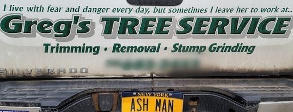
12. “Hey honey, I incorporated how much I hate you into my truck logo”

11. Check yourself before you wreck yourself

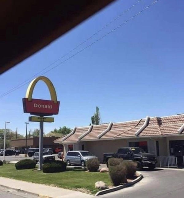
10. Yes, I’ll have a Big

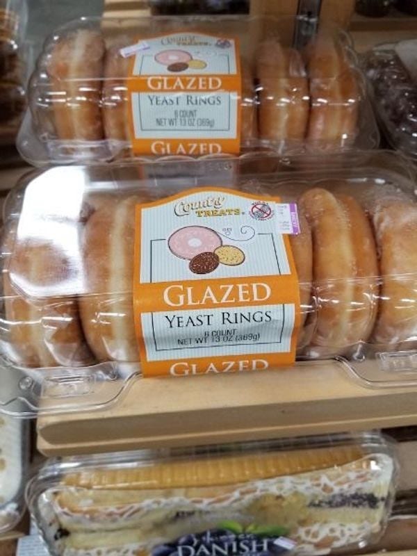
9. How do you make donuts sound unappealing?

8. Wait, what’s traf?

7. Perfect with wieners

6. I didn’t know we were doing this in groups now

5. If that’s just an empty freezer, I’m on board

4. “I don’t know, just make it brown so they don’t read it.”

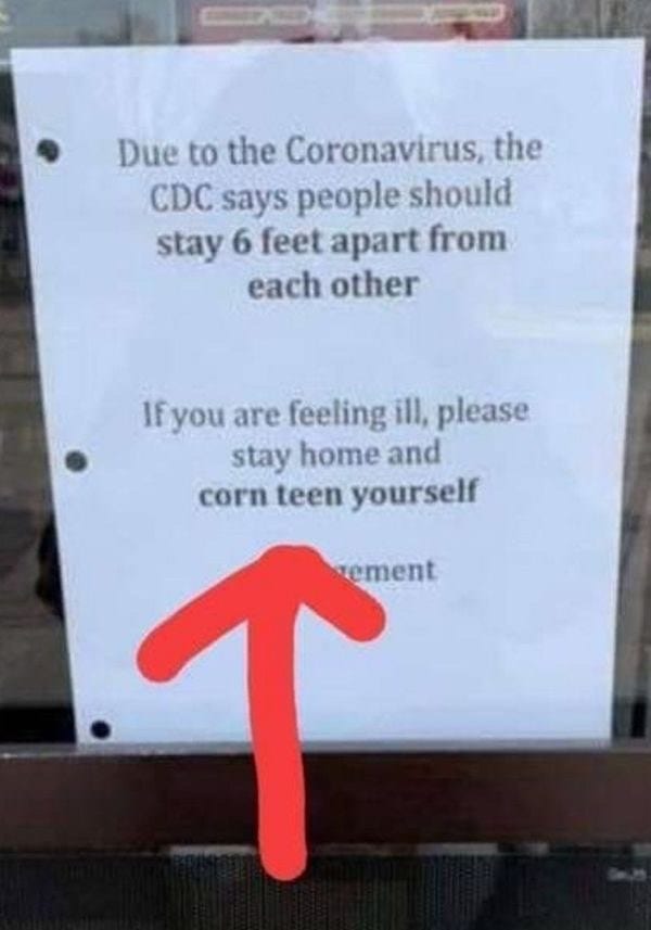
3. No judgement whatsoever

2. I’m sorry, what?

1. Graphic design is my passion

I feel like one or two of those might be Photoshopped, but, truth is stranger than fiction, so, who knows.

What’s the strangest sign you’ve ever seen?

Tell us the tale in the comments below.

The post Weird Signs That Will Make You Do a Double Take appeared first on UberFacts.

Here are Some Signs With Attitude That Might Make You Laugh Today

There are tons of boring jobs out there. Somebody has to make and change the signs for all kinds of businesses, and you know that can’t exactly be a crazy adventure. But that doesn’t mean you can’t have some fun with it – like the people on this list did.

These are twelve examples of signs and other pieces of writing with attitude that would probably make you stop and snort if you came across them in the wild.

12. The great white nope

11. No need to wine about it

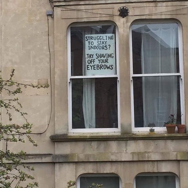
10. Shave-shaming is gonna take off

9. The moral fabric of the universe

8. Don’t forget to wave

7. That’s a lot of words for “volunteer”

6. They tryin’ to start a cat fight?

5. Thanks for the tip

4. Sounds like a little much

3. Unexpectedly wholesome

2. I can’t tell if this is intentional or not

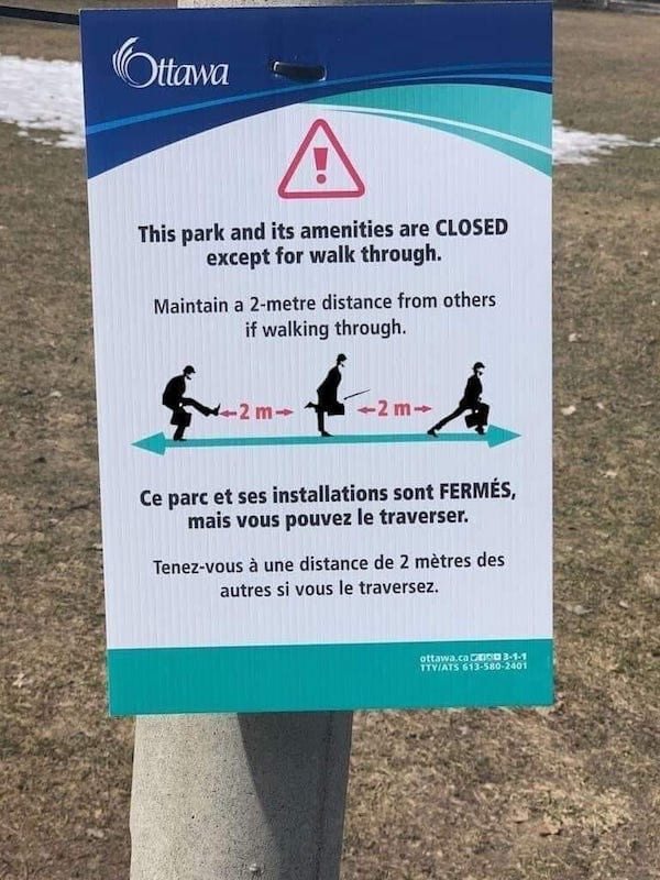
1. Signed, The Ministry of Silly Walks

Seems like signs in general are getting less formal and more playful as culture changes. Maybe it’s just a sign of the times.

…I’ll see myself out.

What’s the funniest sign you’ve ever seen?

Tell us about it in the comments.

The post Here are Some Signs With Attitude That Might Make You Laugh Today appeared first on UberFacts.