Interesting Maps of the U.S. Show How We Can Look at the World in Different Ways

While the U.S. might be as divided as ever, there are a few things that can unite us. One of those things is reading about interesting information and putting it in the proper context.

That’s what the folks over at reddit/r/MapP**n like to do. Check out the following 14 maps that show all of the interesting ways that information about the U.S. (and beyond) are contextualized into something truly unique.

14. Puts the devastation into perspective.

And it’s a lot.

Area of the Australian bushfires compared to the United States from MapPorn

13. Way more on the east coast than I would have expected.

New Mexico making a good showing, though.

UFO Sightings in the United States Based on 90,000 Witness Reports from 1905 to 2015 from MapPorn

12. Reportedly haunted locations.

What is going on in Texas, y’all?

Map of reportedly haunted locations in the US (via Wikipedia). More info in comments! from MapPorn

11. Why do so many places think 16 year olds can make decisions?

18 is pushing it, honestly.

Age of Consent across the United States from MapPorn

10. Really puts it into perspective.

It’s honestly flooring.

Gun deaths per 100 000 in US cities compared to some of the most dangerous countries. Scary stuff… from MapPorn

9. Welp, I guess it’s time for me to move.

What is happening in Arizona?

Venomous animals in the United States from MapPorn

8. People with asthma, take note.

It really does matter where you live.

Mapping Where Traffic Pollution Hurts Children Most from MapPorn

7. We’re all in trouble.

That’s the bottom line here.

Cumulative rates of smoking, obesity & excessive drinking in the United States from MapPorn

6. No one is spared.

For once, we’re all in this together.

Drug overdose deaths by region. from MapPorn

5. This one just looks cool.

Kind of like lightning, I suppose.

Lightning strikes in the contiguous United States, 2018 from MapPorn

4. I guess it’s not unexpected.

I would have expected a bit more variety, though.

Places of death of American presidents from MapPorn

3. I hope y’all on the east coast have got some good bug spray.

Go west! That’s all I see…

Tick-borne disease cases in the United States (2017 data) from MapPorn

2. Whoa, Pennsylvania.

The schools are expensive there, I guess.

Average Debt of University Graduates in the United States in 2017/2018, by state from MapPorn

1. Goodness why are there still so many of these.

Let’s move on, y’all.

United States counties, or equivalents, still named after slave owners. from MapPorn


I just love cool maps – they’re so interesting!

If you do, too, share your favorite map with us in the comments. I’d love to see it.

OR… tell us which one of these made you really interested in learning more!

The post Interesting Maps of the U.S. Show How We Can Look at the World in Different Ways appeared first on UberFacts.

Scientists Put Together the Largest Map of the Universe Ever and It Is a Sight to Behold

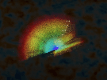
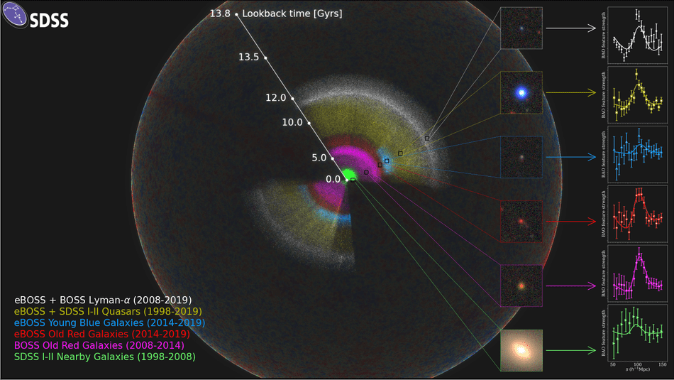
Astronomers who work on the Sloan Digital Sky Survey have released a brand-new 3D map of the entire universe.

The Sloan Digital Sky Survey is a decades-long project that has only had one goal: to map the universe. Now, it seems that they’ve managed to produce the largest-ever map to date.

Over 100 scientists have been working on the project, and the mapped over two million galaxies and quasars while doing so.

The scientists placed the Earth at the center of the map.

We are located at the center of this map. As we look out in distance, we look back in time.

When looking at this map, we see the light that is arriving on Earth from other galaxies. That light takes a long time to reach our planet. For example, it takes 2.5 million years from light from the Andromeda Galaxy to reach us here on our planet.

The map also shows other galaxies that are different distances from our home planet.

The scientists also explain that they use a “cosmic distance ladder” to figure out how far away a galaxy is.

This method depends on making accurate measurements of distances to nearby galaxies and then moving to galaxies farther and farther away, using their stars as milepost markers.

Astronomers use these values, along with other measurements of the galaxies’ light that reddens as it passes through a stretching universe, to calculate how fast the cosmos expands with time, a value known as the Hubble constant.

All of this going over your head a bit? Yeah, us too.

So here’s a video to explain more…

Isn’t this information amazing? Don’t forget to share the map with your friends, and let us know what you think about it in the comments!

The post Scientists Put Together the Largest Map of the Universe Ever and It Is a Sight to Behold appeared first on UberFacts.

Here are Some Interesting Maps of Stuff You Wouldn’t Normally Think to Map

I remember studying atlases for hours when I was a kid and being fascinated by all of the exotic and strange places around the world.

So in the spirit of rekindling my childhood obsession with all things map-related, here are some very interesting maps about all kinds of random things that are quite fascinating.

Let’s take a look.

1. An eagle’s movements tracked over a 20-year period.

Photo Credit: Reddit

2. Tracking different packs of wolves in Voyageurs National Park. You can see how they avoid each other’s territory.

Photo Credit: Reddit

3. Countries talked about in the Bible.

Photo Credit: Reddit

4. The U.S. from an Alaskan perspective.

Photo Credit: Reddit

5. Where flamingos live around the world.

Photo Credit: Reddit

6. The longest possible way to travel by train in the world.

Photo Credit: Reddit

7. Different giraffe patterns in Africa.

Photo Credit: Reddit

8. Each section contains 10% of the world’s population.

Photo Credit: Reddit

9. Locations from Johnny Cash’s song “I’ve Been Everywhere.”

Photo Credit: Reddit

10. The populations of the Dakotas and Manhattan, NYC.

Photo Credit: Reddit

11. 50% of Canadians live below that red line.

Photo Credit: Reddit

12. How much snow it takes to cancel schools.

Photo Credit: Reddit

13. The entire continent of South America is east of Michigan.

Photo Credit: Reddit

Those are awesome!

What did you think? Are you a big map fan?

Tell us all about it in the comments. And if you have a map you’d like to share with us, let’s see it!

The post Here are Some Interesting Maps of Stuff You Wouldn’t Normally Think to Map appeared first on UberFacts.

Check Out this Map Showing the Largest Employer in Every State

Quick: What’s the first thing you notice when you look at this map?

Photo Credit: Visual Capitalist

If your reaction was “Wow, Walmart controls A LOT of the country,” you’d be right. This map shows the largest private employer in every state in the U.S., and Walmart is tops in an incredible 22 states. In total, the company employs 1.5 million Americans.

Photo Credit: Flickr, Mike Mozart

Here’s a full state-by-state list for you to peruse. Who’s #1 in your state?

Alabama: Walmart, 38,041 employees
Alaska: Providence Health & Services, ~4,000 employees
Arizona: Walmart, 33,910 employees

Photo Credit: Wikipedia

Arkansas: Walmart, 53,310 employees
California: University of California, 190,000-plus employees
Colorado: Denver International Airport, 35,000 employees

Photo Credit: Wikipedia

Connecticut: Yale New Haven Health System, 22,193 employees
Delaware: Christiana Care Health System, 11,100 employees
Florida: Walmart, 108,321 employees
Georgia: Walmart, 59,371 employees
Hawaii: University of Hawaii, 10,106 employees

Photo Credit: Wikipedia

Idaho: St. Luke’s Health System, 14,538 employees
Illinois: Walmart, 54,698 employees
Indiana: Walmart, 39,667 employees
Iowa: University of Iowa, 24,598 employees
Kansas: Walmart, 20,938 employees

Photo Credit: Instagram, @walmart

Kentucky: Walmart, 30,181 employees
Louisiana: Walmart, 36,992 employees
Maine: Hannaford Supermarkets, ~8,500 employees

Photo Credit: Wikipedia

Maryland: Johns Hopkins Institutions, 51,725 employees
Massachusetts: Partners Healthcare, 68,000 employees
Michigan: University of Michigan, 48,060 employees
Minnesota: Mayo Clinic, 34,562 employees

Photo Credit: Instagram, @moldol101

Mississippi: Walmart, 24,898 employees
Missouri: Walmart, 43,203 employees
Montana: Walmart, 4,776 employees
Nebraska: University of Nebraska, 16,157 employees

Photo Credit: Instagram, @unlincoln

Nevada: MGM Resorts International, 55,200 employees
New Hampshire: Walmart, 8,284 employees
New Jersey: Wakefern Food Corporation, 35,000 employees
New Mexico: University of New Mexico, 33,390 employees

Photo Credit: Instagram, @uofnm

New York: State Univesrity of New York system, 90,033 employees
North Carolina: University of North Carolina system, 74,079 employees
North Dakota: Sanford Health, 10,581 employees

Ohio: Walmart, 50,481 employees
Oklahoma: Walmart, 34,014 employees
Oregon: Providence Health & Services, 21,000-plus employees
Pennsylvania: University of Pittsburgh Medical Center, 61,000 employees

Photo Credit: Instagram, @ypillemia

Rhode Island: Lifespan system of hospitals, 14,000 employees
South Carolina: Walmart, 32,267 employees
South Dakota: Avera Health, 12,187 employees
Tennessee: Walmart, 41,487 employees

Photo Credit: Instagram, @walmart

Texas: Walmart, 171,531 employees
Utah: Intermountain Healthcare, 38,000 employees
Vermont: The University of Vermont Medical Center, 7,860 employees

Photo Credit: Instagram, @ambearlucci

Virginia: Walmart, 44,621 employees
Washington: Boeing, 71,036 employees
West Virginia: Walmart, 12,321 employees
Wisconsin: University of Wisconsin, 39,000 employees

Photo Credit: Instagram, @uwsystem

Wyoming: Walmart, 4,699 employees

Photo Credit: Instagram, @walmart

h/t: Thrillist

The post Check Out this Map Showing the Largest Employer in Every State appeared first on UberFacts.