A museum says they gave an artist $84,000 in cash to use in artwork. He delivered blank canvases and titled them “Take the Money and Run.”
The post A museum says they gave an artist… appeared first on Crazy Facts.

fact
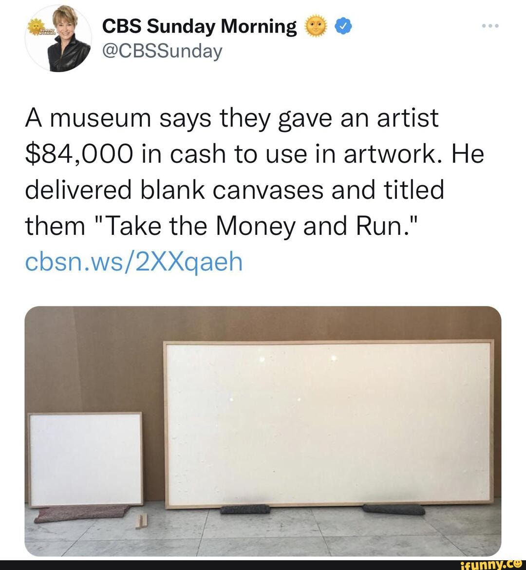
A museum says they gave an artist $84,000 in cash to use in artwork. He delivered blank canvases and titled them “Take the Money and Run.”
The post A museum says they gave an artist… appeared first on Crazy Facts.

The surrealist poet Andre Breton criticized Salvador Dali’s commercial success by nicknaming him “Avida Dollars” which is an anagram for Dali’s name and translates into ‘avid for dollars’. Breton believed that Dali was compromising the integrity of the surrealist movement.
The post The surrealist poet Andre Breton… appeared first on Crazy Facts.

When I was in college, I took some graphic design courses that helped us learn the basics of various Adobe programs, most of which aren’t in use anymore and the ones that are are so different that the class might as well have happened on Mars.
All that to say, I’m familiar with the ideas of design, but I wouldn’t exactly call myself good at them, so I can’t throw stones at bad art.
What I *can* do, however, is throw laughter at them. Which is what I’m gonna get at for the next little while thanks to these amazing design fails via Reddit.
Also it’s no place!
neV york from CrappyDesign
“So like, two puzzle pieces, one with coffee and the other with a donut.”
“Got it, I am definitely a reasonable person and you do not need to be more specific.”
When you just need a little judgement as you return to your abode.
There are so many things wrong with this. At least it has the excuse of being done by a high schooler.
A very easy to read graph about texting while driving? Found in my high school yearbook from CrappyDesign
Yanno, it’s one of those places with a building or whatever.
Got this as a gift and honestly I don’t want to throw it away just because it’s terribly funny from CrappyDesign
I see what you were going for, but no. No thank you.
(unintentionally gross) marble looking keyboard from CrappyDesign
To be fair, maybe the whole point was to make you do a double take and look closer?
Thought maybe this was somebody telling me to be a chicken in Spanish.
Be… what? from CrappyDesign
What is wrong with you?
I don’t think you are supposed to eat it like that from CrappyDesign
We are REALLY having trouble squeezing love into place names, huh?
If only Louisiana looked like a letter of the alphabet. from CrappyDesign
Fails so glorious they really belong in a museum.
What’s been your biggest fail lately?
Tell us in the comments.
The post Design Fails So Big They’re Kind of Impressive appeared first on UberFacts.

There are people who pay no attention to high fashion (even if they follow the trends once they reach the plebs), and there are people who absolutely love to see what each designer puts on the runway for the new season.
No matter which you are, I think we can all agree that fashion is also a form of art, and therefore usually has something to say.
When it comes to these 15 designs, though, the jury is still out as to what – Instagram account @hintmag is bringing us the absolute weirdest things on the runway.
But this is absolutely horrible.
And I kind of feel like I shouldn’t look at any of it?
I would have nowhere to wear it, obviously, but still.
What if your assets don’t fit in there, though?
Sensible AND beautiful. What more could you want?
Those shoes are to die for.
That gold neck thing looks like a dog’s cone, though.
Those sequins really make it pop.
There’s some kind of metaphor there, I think.
And honestly, who hasn’t?
It’s full of secrets.
This makes a statement.
This would be her dream.
I would not be able to manage.
I’m thinking it’s just a standing dress.
It’s almost like they’re pulling our legs, but we know we’re not expected to actually read that. Right?
Have you ever seen someone actually wearing something like this in real life? Tell us the story in the comments!
The post These High Fashion Designs Are Totally Out of the Box appeared first on UberFacts.

There are people who pay no attention to high fashion (even if they follow the trends once they reach the plebs), and there are people who absolutely love to see what each designer puts on the runway for the new season.
No matter which you are, I think we can all agree that fashion is also a form of art, and therefore usually has something to say.
When it comes to these 15 designs, though, the jury is still out as to what – Instagram account @hintmag is bringing us the absolute weirdest things on the runway.
But this is absolutely horrible.
And I kind of feel like I shouldn’t look at any of it?
I would have nowhere to wear it, obviously, but still.
What if your assets don’t fit in there, though?
Sensible AND beautiful. What more could you want?
Those shoes are to die for.
That gold neck thing looks like a dog’s cone, though.
Those sequins really make it pop.
There’s some kind of metaphor there, I think.
And honestly, who hasn’t?
It’s full of secrets.
This makes a statement.
This would be her dream.
I would not be able to manage.
I’m thinking it’s just a standing dress.
It’s almost like they’re pulling our legs, but we know we’re not expected to actually read that. Right?
Have you ever seen someone actually wearing something like this in real life? Tell us the story in the comments!
The post These High Fashion Designs Are Totally Out of the Box appeared first on UberFacts.

I 100% support the idea that fashion is art, and is one way that human beings (not just designers) express who they are on a daily basis.
As a human being who doesn’t really get fashion, I stare in wonder – sometimes horrified, sometimes impressed – at the outfits that sometimes parade down a runway.
Which is why I’m in love with the instagram account @hintmag, which finds the absolute wildest pieces of art/fashion and puts them online.
Please, enjoy.
Nailed it.
I’m a little confused about who loves lungs that much, though?
Make sure and scroll through them all.
I’m open to other options.
There are enough things who shame me the way it is.
For like, a few months straight.
Everyone will be talking.
As long as it’s winter, you’re good to go.
I probably would, too, ngl.
Or maybe it’s just the same meaning. Hmm.
I’m not going to guess what sort of chats you’re going to have, though.
It’s luggage! It’s a dress!
Wear it right on your sleeve.
Just skip a step.
Now I don’t even have to ask.
No more short/tall people shaming!
Who would have guessed how attractive that would become?
Sometimes I can’t tell if these designers are just messing with us, to be honest.
What’s the wildest thing you’ve ever seen someone wearing? Tell us about it in the comments!
The post 17 Crazy Professional Fashion Outfits appeared first on UberFacts.

I 100% support the idea that fashion is art, and is one way that human beings (not just designers) express who they are on a daily basis.
As a human being who doesn’t really get fashion, I stare in wonder – sometimes horrified, sometimes impressed – at the outfits that sometimes parade down a runway.
Which is why I’m in love with the instagram account @hintmag, which finds the absolute wildest pieces of art/fashion and puts them online.
Please, enjoy.
Nailed it.
I’m a little confused about who loves lungs that much, though?
Make sure and scroll through them all.
I’m open to other options.
There are enough things who shame me the way it is.
For like, a few months straight.
Everyone will be talking.
As long as it’s winter, you’re good to go.
I probably would, too, ngl.
Or maybe it’s just the same meaning. Hmm.
I’m not going to guess what sort of chats you’re going to have, though.
It’s luggage! It’s a dress!
Wear it right on your sleeve.
Just skip a step.
Now I don’t even have to ask.
No more short/tall people shaming!
Who would have guessed how attractive that would become?
Sometimes I can’t tell if these designers are just messing with us, to be honest.
What’s the wildest thing you’ve ever seen someone wearing? Tell us about it in the comments!
The post 17 Crazy Professional Fashion Outfits appeared first on UberFacts.

If you’ve ever seen a movie poster and thought, “I’ve seen that movie before,” it might be because there’s an art, a science, and a psychology that goes into the branding of movies.
Studios have found formulas that work, and there’s not much deviation.
One eagle-eyed viewer first noticed a similar pattern in Disney posters, and raised it on Tumblr.
Although the posters are from 3 different franchises: X-Men, Star Wars, and the new live-action recreation of old cartoons, users agreed, they color scheme and effects made them look like a single trilogy.
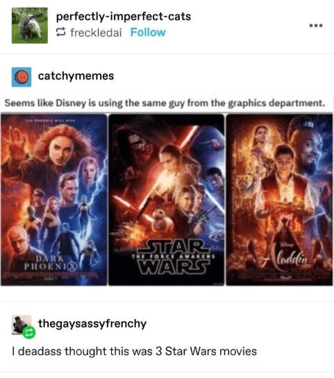
Image credit: Tumblr via Cheezburger
User @metalgirlysolid explained that this was not just laziness on the part of the designer, but an intentional part of the marketing, using what’s known as Color Theory.
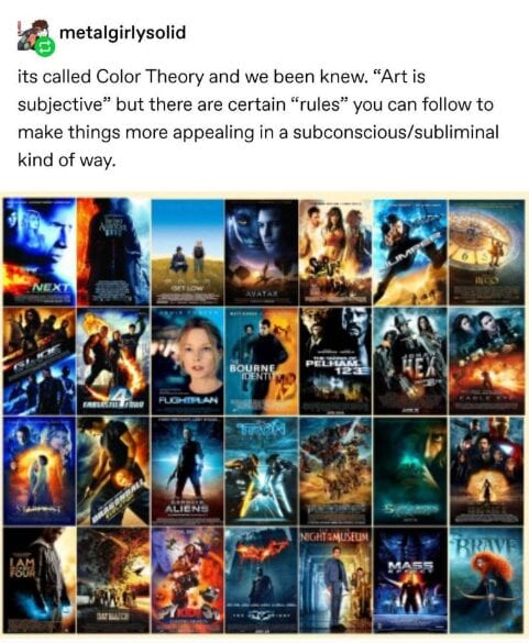
Image credit: Tumblr via Cheezburger
The user then posted a series of thematically linked movie posters.
The first showed how teal and fiery orange tend to be used in action flicks, particularly with a sci-fi bent like Aliens and The Bourne Identity.
The next showed how often a red dress is featured in female-centered movies like Amelie, Frida, and Resident Evil.
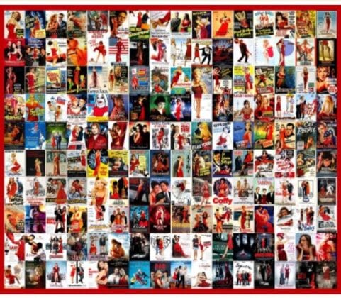
Image credit: Tumblr via Cheezburger
According to 99 Designs:
Red is the universal sign of excitement, passion and anger. It draws attention and makes you stand out from the crowd. Is your brand loud, playful, youthful or modern? Think red.
Next came a collage of more in the blue and yellow vein, but softer than the ones that screamed “action flick.”These had a warm, glowy quality, with wistful looking actors staring out at you or couples together.
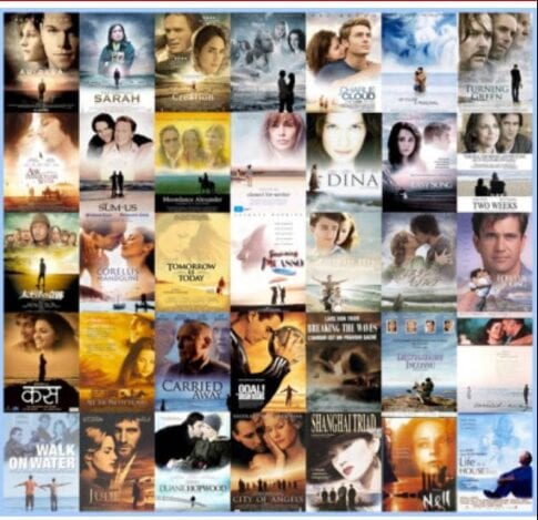
Image credit: Tumblr via Cheezburger
It featured dramas like Captain Correlli’s Mandoliln and City of Angels.
Apparently that’s because:
Blue symbolizes trustworthiness and maturity. You should use it for your brand if you want to be taken seriously.
Then @metalgirlysolid moved from color to imagery, showing all the gritty action movies that feature a domineering silhouette, usually from behind, getting ready to take on the world.
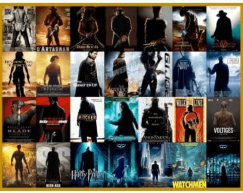
Image credit: Tumblr via Cheezburger
This grouping included D’Artagnan, GI Joe, and The Hitcher.
Next came Rom Coms, where studios like to show couples standing back to back: Pretty Woman. Two Weeks Notice.

Image credit: Tumblr via Cheezburger
It’s an especially good stance for the enemies to lovers trope, but studios aren’t too fussy.
Then there are the movie posters that feature a close-up of an eye. Color doesn’t matter, nor does the species of the eye.
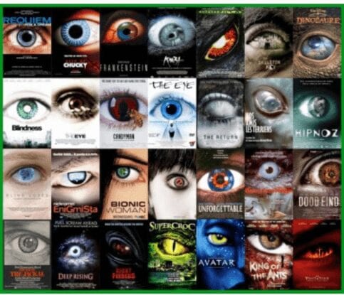
Image credit: Tumblr via Cheezburger
This style always evokes Requiem for a Dream for me.
Again there were more blue action movies, everything from Taken to The Firm.
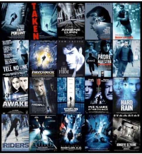
Image credit: Tumblr via Cheezburger
One particular style stands out as arguably demeaning towards women.
Often used for raunchy comedies, it features the “between the legs” shot.
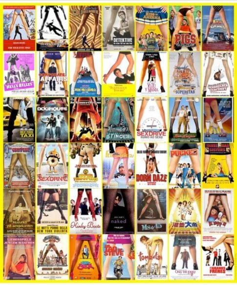
Image credit: Tumblr via Cheezburger
Personally, not a fan, but they’re not marketing to me.
And finally, the rather modern trend of black and white and orange for explosive action movies.
It seems to be a favorite for Nicholas Cage vehicles.
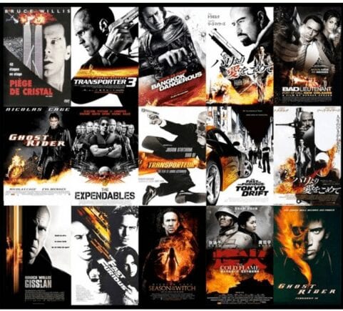
Image credit: Tumblr via Cheezburger
99 Designs explains the possible emergence of this color palette as a dominant player.
Go orange to stand out from the crowd. It’s used less often than red, but still packs an energetic punch. Be cautious when using orange if your brand is trying to appear luxurious, feminine or serious, as orange does not invoke those traits to consumers.
They got that last part right.
Tumblr users were duly impressed with this knowledge drop.
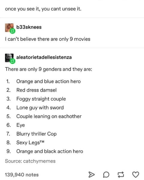
Image credit: Tumblr via Cheezburger
The user is right. Once you see it, you can’t unsee it.
At least it helps to set viewer expectations, but no wonder everything seems so familiar.
Did this blow your mind like it did the folks on Tumblr? Tell us in the comments.
The post Learn About the 9 Types of Movie Posters and Why They Never Change appeared first on UberFacts.

For me, one of the coolest things to come out of the pandemic was people being forced to find new (distanced) ways to connect with friends, family, neighbors, and even strangers who cross our paths on a daily basis.
Companies found new and innovative ways to find customers, education systems had to revamp to reach out to every willing student, and even artists unearthed brilliant ways to continue to connect and inspire the public.
In Ann Arbor, Michigan, David Zinn does street art with chalk – on brick, concrete, or whatever else will take – and the images stick with people, long after they’re washed away by the rain.
Below are 16 images that will make it easy to see why once you’ve seen some of his work, you aren’t likely to forget it!
Don’t you love to see it?
View this post on Instagram
I would definitely read that.
View this post on Instagram
They look so serious and cozy!
View this post on Instagram
I wonder if he sees his shadow or just a bunch of smiling faces.
View this post on Instagram
Emerging from the tunnel, striking a match.
View this post on Instagram
That’s just the rules of the universe!
View this post on Instagram
What more could one want from a piece of art?
View this post on Instagram
It looks like he could just hop right off any second!
View this post on Instagram
These pictures are gentle and so heartwarming!
View this post on Instagram
Music lovers everywhere can relate.
View this post on Instagram
For them AND for me.
View this post on Instagram
How can it not?
View this post on Instagram
Who doesn’t? They bring the SPRING!
View this post on Instagram
He’s way happier to see me than most humans are!
View this post on Instagram
The skill AND the feeling.
View this post on Instagram
Don’t you want to know where he’s going?
View this post on Instagram
I wish I had talent like this – wow!
Which of these was your favorite piece? Tell us why down in the comments!
The post This Artist Proves That a Little Chalk Can Bring a Lot of Magic to the Block appeared first on UberFacts.

Hey there. Take a little break from Facebook and enjoy some bookface.
No, I didn’t just have a stroke. At least I don’t think I did. It’s hard to tell since I’ve been scrolling through all these trippy book covers for a while. But I can easily explain:
#BookFace is a thing, or a “challenge” if you want to feel more accomplished, where people on Instagram match themselves up with the people on book covers, and then we all celebrate that instead of reading anything. It’s great fun! Come see!
She’s here and she means business.
Because of you I’m laughing pretty hard right now.
(The title is in Norwegian. Took me way too long to realize that.)
Legs that go on for a finite amount of time.
We’re truly through the rabbit hole now.
No idea what the title is but the whole thing is looking suave.
Just as we all remember him.
She’s in another world now.
A sequel to the one higher in the list?
You just gotta do you.
When you just gotta grow yourself something nice.
This is no specific book. It’s just the book we need.
No, thank U.
This is truly beyond the pale.
Where are you taking us, though?
And with all the book face out of the way, you can return to Facebook.
But first! What’s your favorite book?
Tell us in the comments.
The post Now is the Time to Embrace the #BookFace Challenge appeared first on UberFacts.