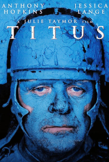
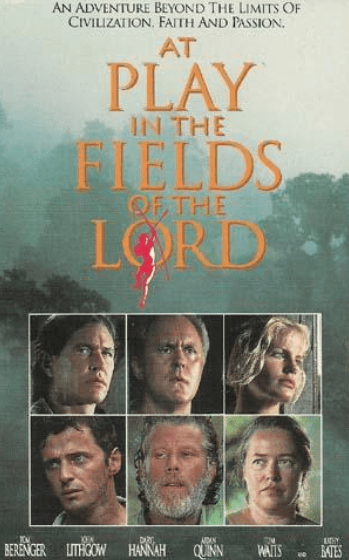
The next time you’re at your local movie theater, keep an eye out for the movie posters lining the halls. Notice anything peculiar? That’s right, a lot of posters use the same typeface to advertise films.

Photo Credit: Fox Searchlight
The familiar font is called Trajan, and it was designed by a woman named Carol Twombly in 1989. Twombly worked for Adobe, and the font became extremely popular because many designers used Adobe software to create movie posters. This signaled a change in the movie poster industry. The first film to use the font in its advertisements was At Play In the Fields of the Lord.

Photo Credit: Universal Pictures
Other designers caught on to Trajan and soon the font was seen everywhere in film advertising. These days, Trajan is used more for direct-to-video and B and genre movies.

Photo Credit: Sony Pictures
Designers use Trajan to give movies more of an “epic” feel, even if they are low-budget horror films. We’re talking about advertising here, remember?
Watch the video below for more about the history of the font and its use.
The post Ever Wondered Why so Many Movie Posters Use the Same Typeface? appeared first on UberFacts.
