
A picture is worth a thousand words.
And while I sometimes think a few words would go a long to providing context for pictorial furniture instructions, I do love a good infographic.
Here are 15 super useful infographics that you might want to keep close at hand.
1. For quick, easy reference
I love an easy reference cooking chart. I use the one for my InstantPot ALL. THE. TIME.
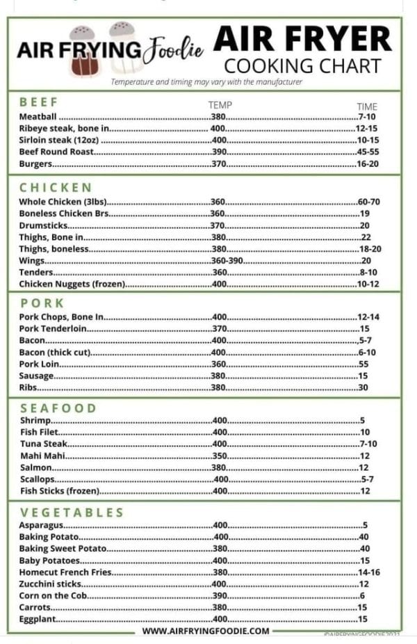
Image credit: eBaum’s World
2. For every day mishaps
I literally needed this yesterday. Time to put it on the fridge.
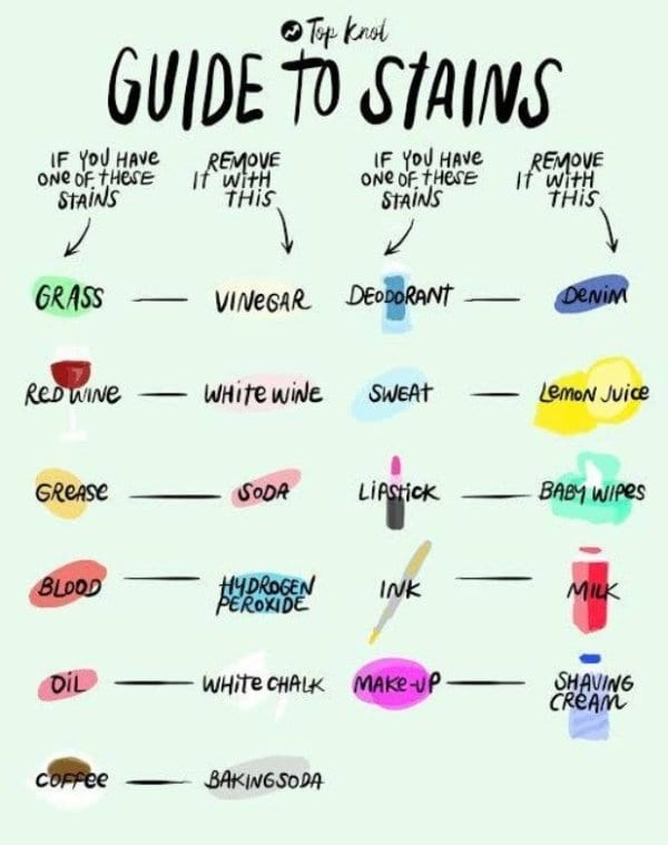
Image credit: eBaum’s World
3. For those with a black thumb
If only it covered every kind of plant. Specifically snake plants (asking for a friend).
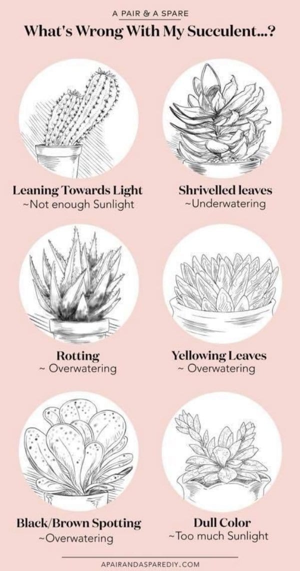
Image credit: eBaum’s World
4. For those who like to party
The longer I look at this, the more fascinating it becomes.
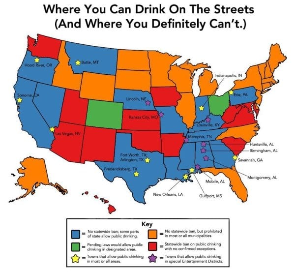
Image credit: eBaum’s World
5. For those who really like to party
Just kidding, this is actually really useful information that everyone should know.
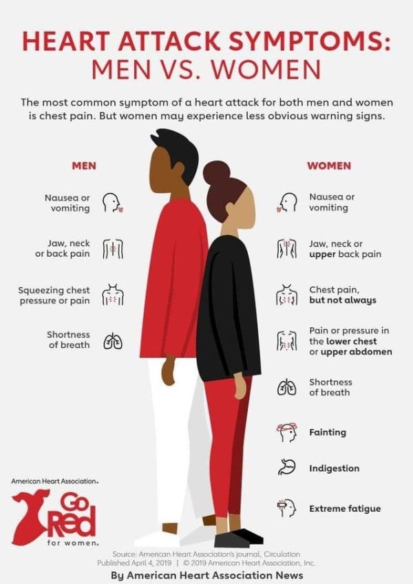
Image credit: eBaum’s World
6. For life’s little disappointments
Keep this one in your glove box. It should come free with every pair of jumper cables.
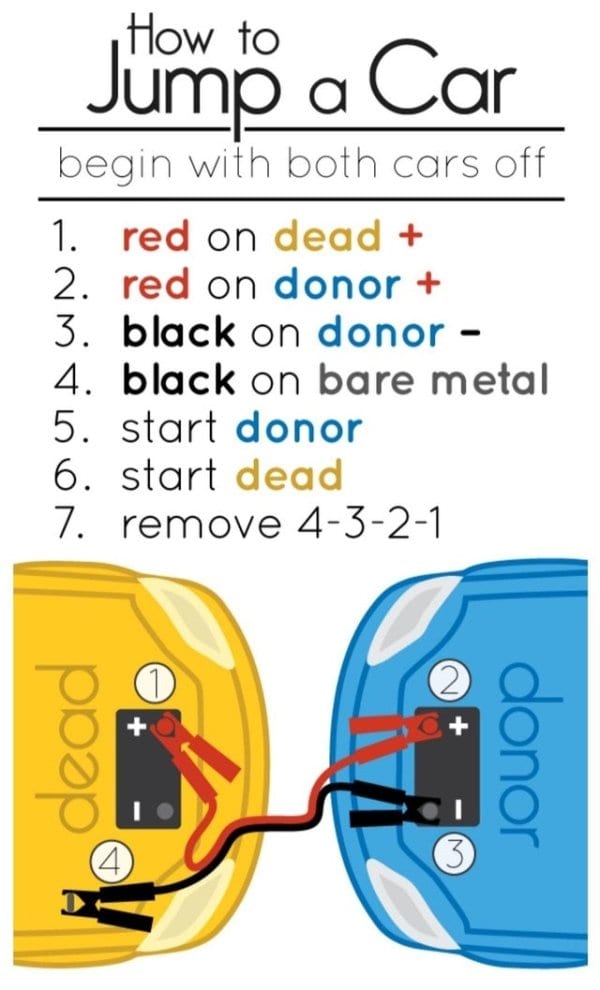
Image credit: eBaum’s World
7. For when you want to be fancy
Keep it in your purse for dining out. I love that there’s a special signal that you didn’t like your meal.
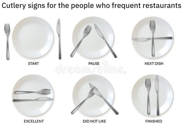
Image credit: eBaum’s World
8. For sending a subtle message
Tape this on the back of the remote, the Ipad, the laptop…
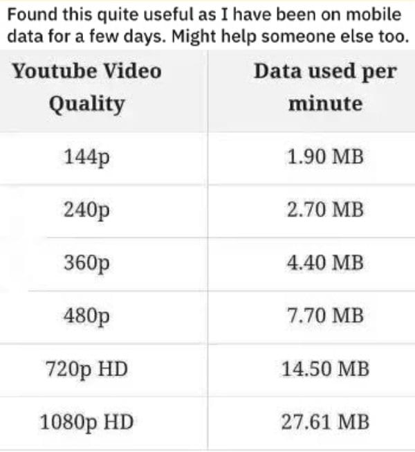
Image credit: eBaum’s World
9. For planning your epic family vacation
Get ready Route 66, the road trip is about to have a resurgence.
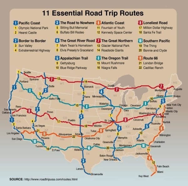
Image credit: eBaum’s World
10. For when technology feels overwhelming
Because you know you’re getting old when you’re grouchy about new USBs.
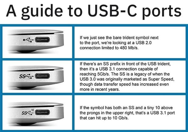
Image credit: eBaum’s World
11. For when you need to prove a point
Welcome to healthcare in America.
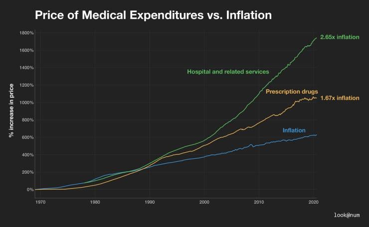
Image credit: eBaum’s World
12. & 13. For when you have a pressing science question
About space…
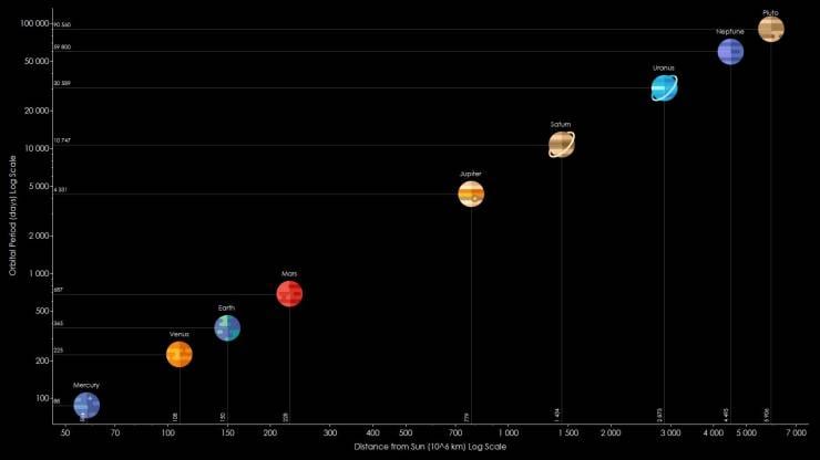
Image credit: eBaum’s World
or about anatomy…
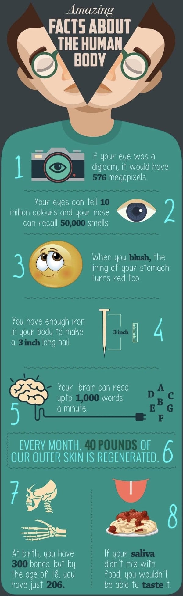
Image credit: eBaum’s World
14. For when you want to avoid an allergic reaction
Is it worth the risk? Only you can decide!
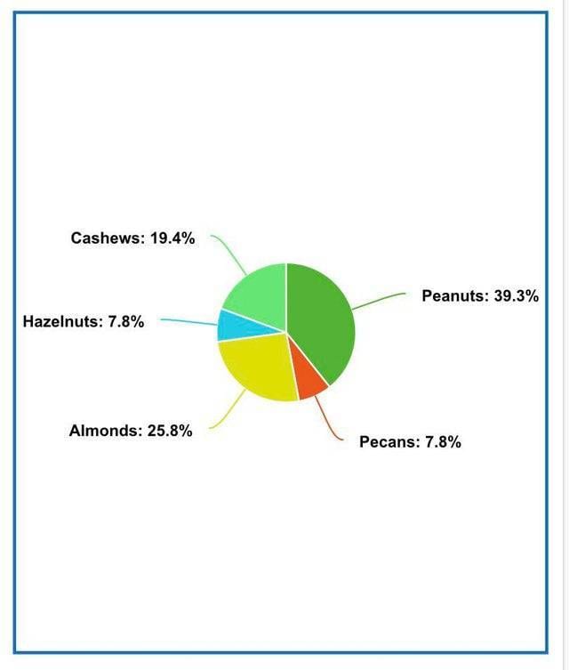
Image credit: eBaum’s World
15. For when you have a pressing frosting need
I personally only use the large round one, but that’s just me.
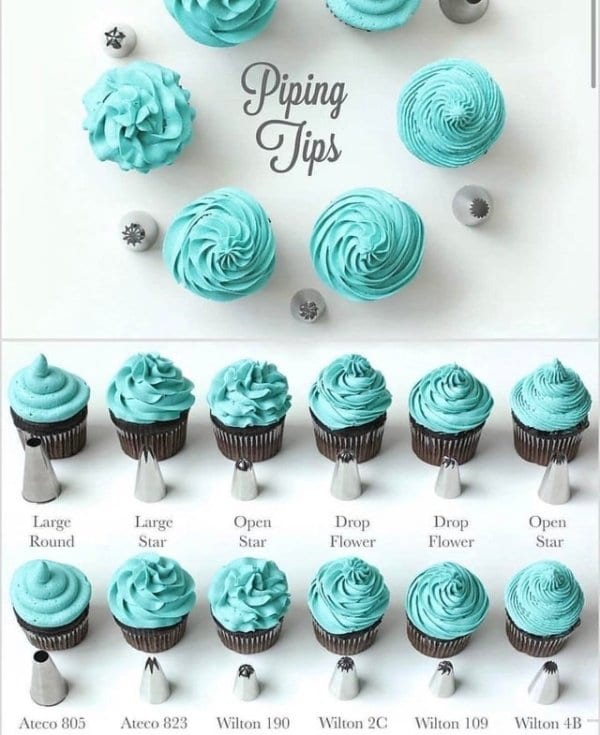
Image credit: eBaum’s World
These all definitely show how an infographic can go a long way to helping in any situation.
I kind of wish I had known about them as a kid. I think I would have won a lot more arguments.
Are you a visual learner? Do you like a good graphic? Let us know in the comments.
The post Take a Look at These Infographics That Could Really Help You Out appeared first on UberFacts.
 . "It's not under the E yet…" . #dodge #jeep #srt #srt8 #mopar #hemi #turbo #twinturbo #boostedcars #horsepower #americanmuscle #custom #modified #moparornocar #lowfuel #gas #srt4 #srt10 #viper #challenger #charger #300c #neon #truestreetperformance #carmemes #lol #airplanemovie


