If you’ve ever seen a movie poster and thought, “I’ve seen that movie before,” it might be because there’s an art, a science, and a psychology that goes into the branding of movies.
Studios have found formulas that work, and there’s not much deviation.
One eagle-eyed viewer first noticed a similar pattern in Disney posters, and raised it on Tumblr.
Although the posters are from 3 different franchises: X-Men, Star Wars, and the new live-action recreation of old cartoons, users agreed, they color scheme and effects made them look like a single trilogy.
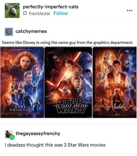
Image credit: Tumblr via Cheezburger
User @metalgirlysolid explained that this was not just laziness on the part of the designer, but an intentional part of the marketing, using what’s known as Color Theory.
![]()
Image credit: Tumblr via Cheezburger
The user then posted a series of thematically linked movie posters.
The first showed how teal and fiery orange tend to be used in action flicks, particularly with a sci-fi bent like Aliens and The Bourne Identity.
The next showed how often a red dress is featured in female-centered movies like Amelie, Frida, and Resident Evil.
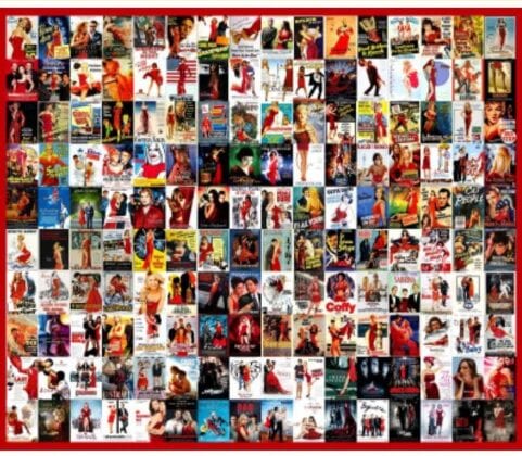
Image credit: Tumblr via Cheezburger
According to 99 Designs:
Red is the universal sign of excitement, passion and anger. It draws attention and makes you stand out from the crowd. Is your brand loud, playful, youthful or modern? Think red.
Next came a collage of more in the blue and yellow vein, but softer than the ones that screamed “action flick.”These had a warm, glowy quality, with wistful looking actors staring out at you or couples together.
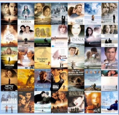
Image credit: Tumblr via Cheezburger
It featured dramas like Captain Correlli’s Mandoliln and City of Angels.
Apparently that’s because:
Blue symbolizes trustworthiness and maturity. You should use it for your brand if you want to be taken seriously.
Then @metalgirlysolid moved from color to imagery, showing all the gritty action movies that feature a domineering silhouette, usually from behind, getting ready to take on the world.
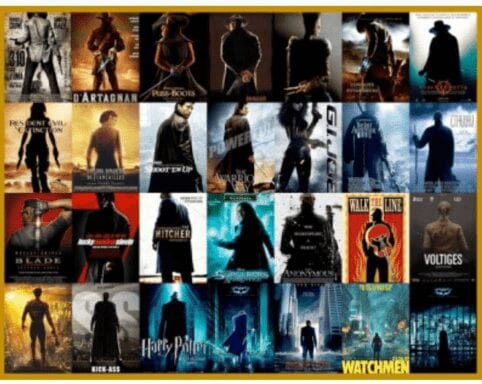
Image credit: Tumblr via Cheezburger
This grouping included D’Artagnan, GI Joe, and The Hitcher.
Next came Rom Coms, where studios like to show couples standing back to back: Pretty Woman. Two Weeks Notice.

Image credit: Tumblr via Cheezburger
It’s an especially good stance for the enemies to lovers trope, but studios aren’t too fussy.
Then there are the movie posters that feature a close-up of an eye. Color doesn’t matter, nor does the species of the eye.
![]()
Image credit: Tumblr via Cheezburger
This style always evokes Requiem for a Dream for me.
Again there were more blue action movies, everything from Taken to The Firm.
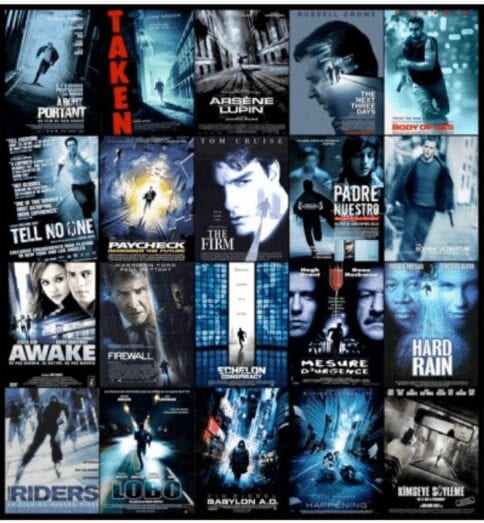
Image credit: Tumblr via Cheezburger
One particular style stands out as arguably demeaning towards women.
Often used for raunchy comedies, it features the “between the legs” shot.
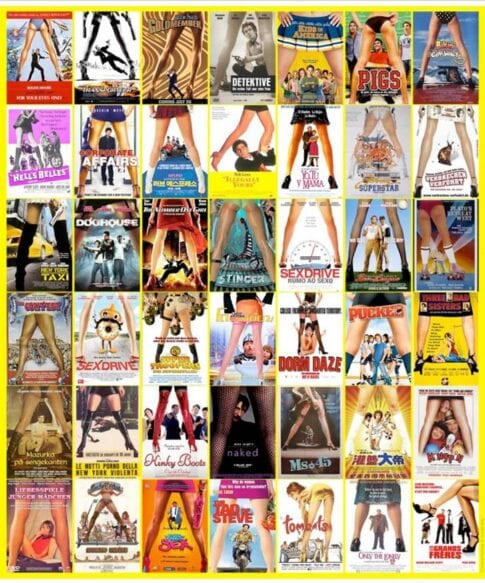
Image credit: Tumblr via Cheezburger
Personally, not a fan, but they’re not marketing to me.
And finally, the rather modern trend of black and white and orange for explosive action movies.
It seems to be a favorite for Nicholas Cage vehicles.
![]()
Image credit: Tumblr via Cheezburger
99 Designs explains the possible emergence of this color palette as a dominant player.
Go orange to stand out from the crowd. It’s used less often than red, but still packs an energetic punch. Be cautious when using orange if your brand is trying to appear luxurious, feminine or serious, as orange does not invoke those traits to consumers.
They got that last part right.
Tumblr users were duly impressed with this knowledge drop.
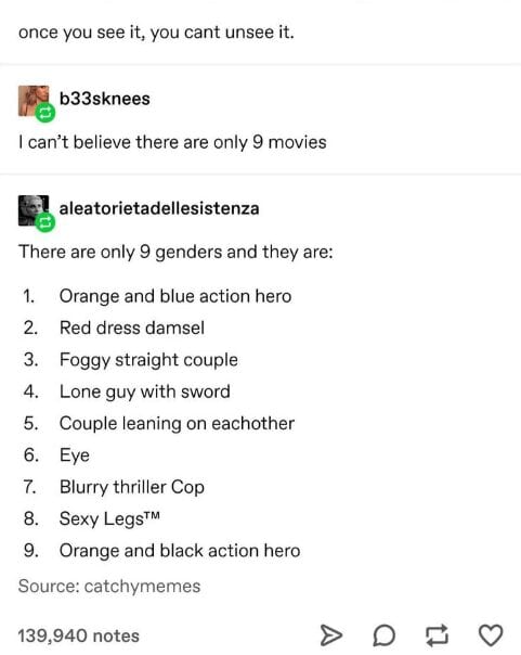
Image credit: Tumblr via Cheezburger
The user is right. Once you see it, you can’t unsee it.
At least it helps to set viewer expectations, but no wonder everything seems so familiar.
Did this blow your mind like it did the folks on Tumblr? Tell us in the comments.
The post Learn About the 9 Types of Movie Posters and Why They Never Change appeared first on UberFacts.